10 Popup Design Trends for 2021
10 min read time
Published on Nov 4, 2019
Written by Meg Johnson
As we start the new year, it's time to reflect on the past and think about what we’re going to do differently in 2021. Whether that’s putting in a few extra hours at the gym or learning how to design captivating pop ups, we’re here to support you!
Pop ups can be a game changer for improving your conversion rate or generating new subscribers, but not all popups are created equal. There are a million different possible designs and templates, some eye-catching and some low-key, but which ones actually work and ensure your lead generation efforts don’t go to waste? In this article we go over ten pop up design trends we predict will make their mark this year and help convert more visitors on your site.
Table of contents
What are popups and how do they work?
Pop up design: Complex gradient
Pop up design: Hand drawn elements
Pop up design: High resolution authentic photography
Pop up design: Bold, expressive typography
Pop up design: Simplicity
Pop up design: GIFS/Motion graphics
Pop up design: Granite, marble, terrazzo textures
Pop up design: Bright colors
Pop up design: Abstract geometry and patterns
Pop up design: Playful CTA text
Get our best content on ecommerce marketing in your inbox 2 times a week
What are pop ups and how do they work?
Pop ups are messages that are triggered to appear when a user takes a certain action on a page, whether it’s simply visiting the page, scrolling to a certain point, or idling on the page for a certain length of time. Businesses use pop ups to improve conversion rate, capture visitors with exit-intent, and drive further engagement.
10 best pop up design trends of 2021
In this list we cover our favorite aesthetic trends for popups in 2021, from typography to GIFs and motion graphics.
1. Pop up design: Complex gradient
This design trend started in 2018 with Instagram’s logo upgrade and continues to grow in popularity as apps like Spotify and Hulu integrate gradients and duotones into their products and marketing. There are so many online tools for making gradients, but the key to making a dynamic gradient is choosing colors that don’t contrast too much, otherwise the middle of the gradient becomes neutral and muddy looking. The easiest and best way to avoid this is by making sure both ends of the gradient are viewable. That way the eye is drawn towards the brightest of both colors instead of the neutral space in between.
Pop up design examples
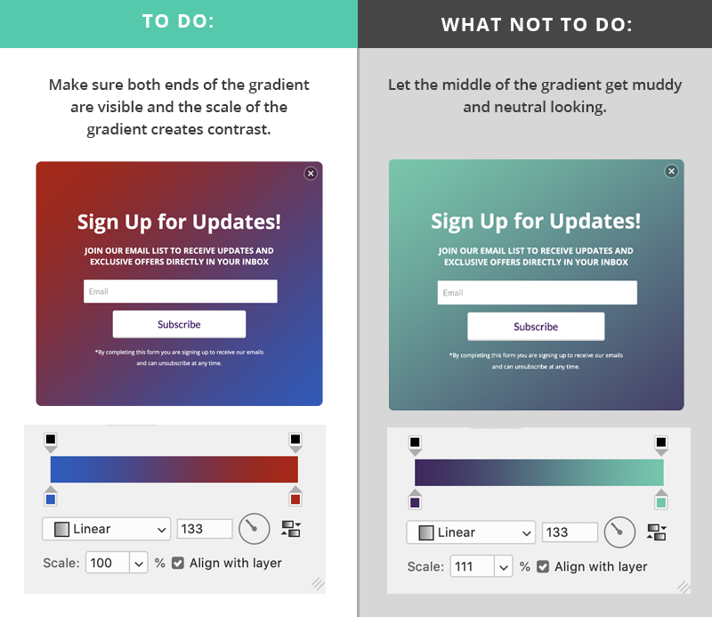
When using a complex gradient, think less about jamming a ton of different colors in the space, and instead choose tints and shades of two different colors to create a smooth transition between the colors while also adding more contrast and brightness to the gradient.
Pop up design examples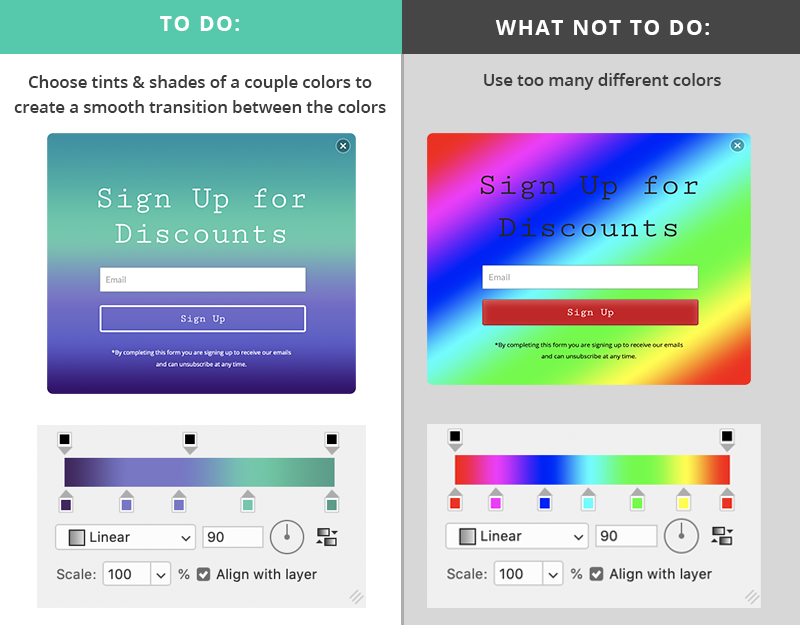
|
Once you've found the best gradient for your pop up, we'd love to help you get it up and running on your website. |
2. Pop up design: Hand drawn elements
If you’ve seen Mailchimp’s latest rebrand, it’s easy to see that the fun loving brand is diving head first into custom hand drawn illustrations and icons.
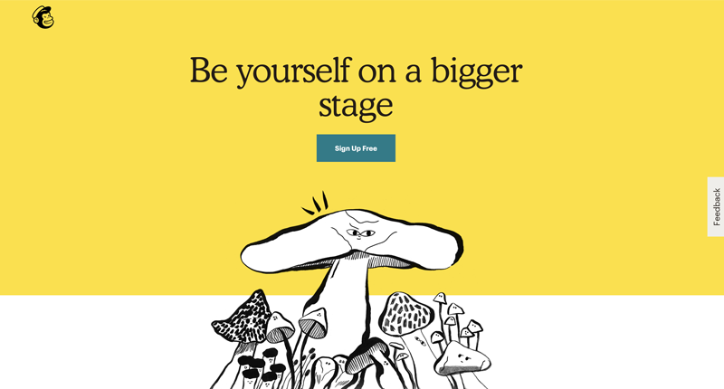
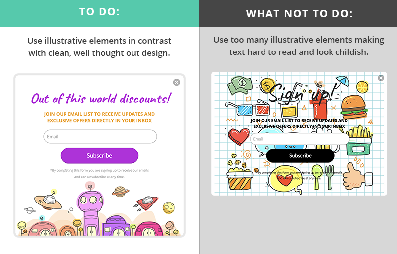
The key to successfully incorporating hand drawn elements is to use them in contrast with clean, well thought out design. If you make everything hand drawn you run the risk of your design being hard to read and it could end up looking more like children’s artwork than a whimsical design element.
Pop up design examples
3. Pop up design: High resolution authentic photography
If you know what a meme is, you understand how crucial it is to use authentic looking photography. Find images that portray true emotion, show a variety of people, and coincide with your product. There are tons of free stock photo websites that are devoted to providing quality photography without breaking your budget. Burst by Shopify is one of our personal favorites. Using a blurry, dare I say, bad stock photo is surely one way to get your design on the front page of Reddit, but is not a good look for converting traffic. On the other hand, if your brand and audience thrives on memes, head to r/shittystockphotos for inspiration and go for it! Just make it clear that you’re in on the joke.
Pop up design examples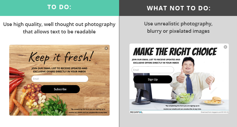
4. Pop up design: Bold, expressive typography
If you’ve ever visited Times Square in New York City, you’ll understand the impact large text has on a viewer. Still, even at a not-so-massive scale, using large typography has been a consistent trend that seems to not fall out of style since the mid-60’s. Although this trend thrived during the Beatlemania era, the trend truly started when designers in the 60’s found inspiration from jazz album covers.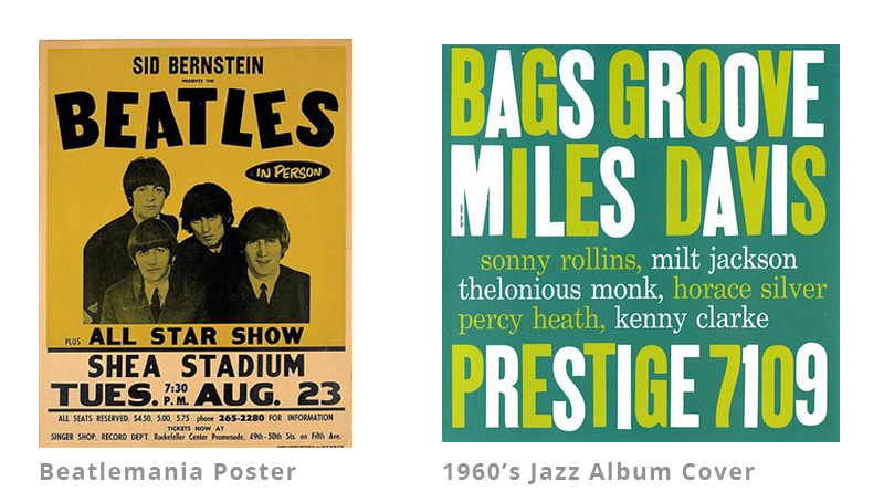
Like the music, jazz album covers were bold, and made unexpected and experimental typography choices that made them stand out from the photography heavy designs prior to then. The important things to remember when dealing with the scale of typography are contrast and hierarchy. You don’t want everything to be big and bold because then it’s hard to know what's actually important. Create contrast between the different levels of information. For more help with that, read this other design tip blog post where I go through some examples of what to do and not to do.
5. Pop up design: Simplicity
Keep it simple. Sometimes over designing is worse than under designing. When over designing, there are often too many design elements going on like too much text or imagery which can make it hard to read the message of the design. More websites and apps are realizing that mobile devices provide a limited amount of space, and with mobile now accounting for over half of all ecommerce sales it’s important to think about the mobile experience your visitors are having.
It’s no longer acceptable for mobile websites not to be user friendly since more often than not, your mobile site is the first touch a customer has with your brand. For more tips on designing for mobile check out this mobile design video or mobile design magic post from last year.
(Ever wonder what marshmallows have to do with mobile design? Check out this video to find out.)
6. Pop up design: GIFS/Motion graphics
Motion graphics have skyrocketed in popularity as apps like Facebook Messenger and other texting apps integrate GIF keyboards into mobile device messaging services, making it easier than ever to share your excitement with a screaming Kermit the Frog GIF.
via GIPHY
Motion graphics are great because they allow people to connect to one another through pop culture references with a click of a button, and are attention grabbing when in a social media feed or email. Some of our customers even use GIFs within their Privy displays and have seen higher rates of engagement because of this. Learn more about adding GIFs and video embeds to your Privy displays with this help doc.
7. Pop up design: Granite, marble, terrazzo textures
Textures are a great way to add a touch of creativity without over designing. Specifically marble and terrazzo textures do well as backgrounds because their textural elements are less prominent and allow text to be more readable when placed on top of it. Head to any Target and you’ll realize marble textures are everywhere in today’s marketing.
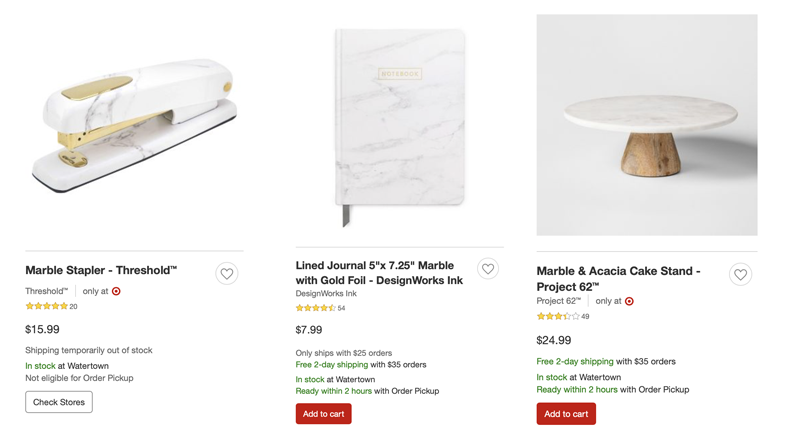
Whether it's a phone case, poster background, or toilet seat cover, marble gives it that classy but clean look and feel that a lot of brands have adopted over the past year. Marble has become the replacement to the chevron phase we all know and love/hate.
8. Pop up design: Bright colors
Now hear me out, we don’t want to go all 80’s neon vaporwave on anyone so choose those bright colors wisely. Taking some time to mellow out, bright colors have made their comeback in 2019, and will contrast nicely with the simple minimalist trend that’s sweeping the Instagram feeds around the world.
Pop up design examples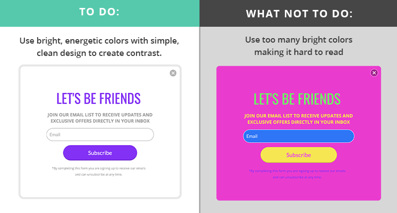
9. Pop up design: Abstract geometry and patterns
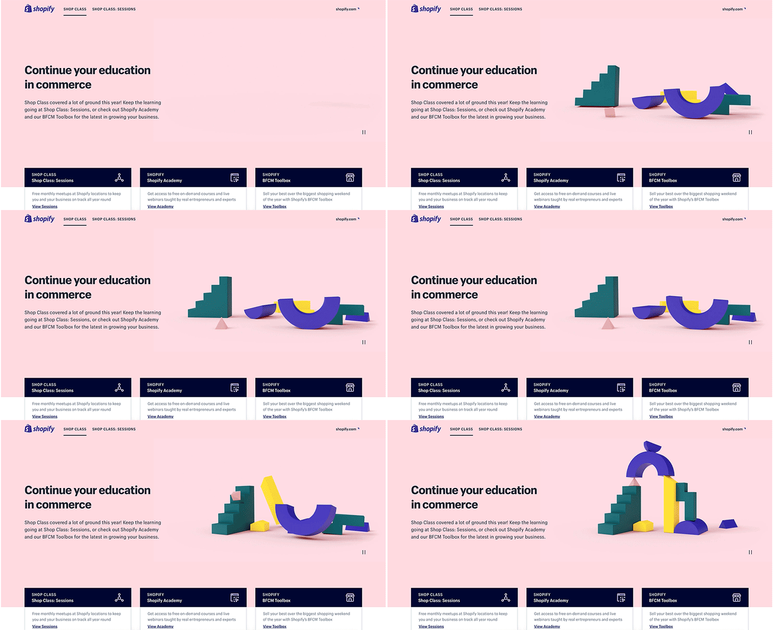
In conjunction with the simple is better trend, basic geometric shapes and patterns have made their way into the spotlight this year. Shopify incorporated this trend into their Shop Class branding and mixed with their playful motion graphics, the simplicity and bold color choices made for a beautifully fun, well-designed campaign.
10. Pop up design: Playful CTA text
With brand design becoming more prominent in businesses today than ever before, one way to leave a lasting impression on your visitors is to find ways to delight your visitor with your brand *Bonus points if it’s in unexpected areas. One area to do this is in the call the action text. Whether it’s in an email, website page or paid advertising, visitors are pretty numb to the “Learn more”, “Download Now”, “Read More” tag lines you'll find in old school CTA buttons.
Instead, think of how to make the CTA more specific to the content and maybe even get a chuckle out of it. Some of my favorite examples of this are on the Privy blog where we’ve experimented with CTA’s like “Hop in Your Delorean” which was a fun way of saying “Head to this 80’s tees website”. It’s relevant but different than the average “Learn More”, and much more memorable than “Shop Now”.
The example designs listed above are great for exit-intent popups to catch a visitor’s attention before they leave without checking out. Although a lot of these pop up design trends seem to have been around for a while now, history tends to repeat itself and it is no different for design. Who knows, maybe next year we’ll be reviving that drop shadowed and embossed text look from the early 90’s that I totally do not miss. Take some time to think about which trends you’re going to try and comment below. Stay up to date on design and marketing tips by joining our email list. Finally take a look at more popup examples from Privy merchants! Happy creating!
Subscribe for Updates
Get our best content on ecommerce marketing in your inbox 2 times a week.

Written by Meg Johnson
Armed with a degree from MassArt, a passion for avocados, and a "I'm going to crush this attitude," Meg elevates Privy's approach to brand, design, video and most importantly, fun.
Subscribe for Updates
Get our best content on ecommerce marketing in your inbox 2 times a week.

.jpg)
