How to Create a Stunning Email With Privy: 15+ Design Tips and Best Practices
13 min read time
Published on Oct 13, 2023
Written by Anna Smith
A well-designed email is a key component to effectively communicating with your audience, building engagement and trust, and ultimately driving sales.
I'm the brand designer here at Privy, and I've created a lot of emails using our email editor. In this post, I'll walk through some tips and tricks on exactly how to create engaging and effective emails using Privy's email editor.
Table of Contents:
- Getting Started
- Layout
- Global Design Settings
- Background Options
- Images
- Button Styling
- Optimizing for Mobile
Get our best content on ecommerce marketing in your inbox 2 times a week
Getting Started
Choosing a template:
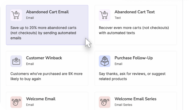
Once you click “create email,” you'll need to choose a template to get started. You have a few options here:
- Basic template
- Privy/seasonal template
- Your saved templates
Basic templates are just that — basic. They contain a few sections for things like text, images, and buttons. If you have your brand settings uploaded in Privy, they’ll pull in your brand colors, fonts, logo, and social media. So if you want to design your email from scratch or aren’t looking to do anything too complicated, basic templates are the way to go.
Privy or seasonal templates contain styling, sample text, and imagery to get you started quickly. They’ll also pull in your logo and socials. These templates are a great way to get inspired and hit the ground running without a ton of design work.
Saved templates are emails you've created yourself. Turning your emails into templates is a great way to keep your emails consistent and save yourself time.
Whichever route you take, you’ll likely need to put in a bit of work to make your emails fit your brand and message. But there are some really simple steps you can take to elevate your emails right within Privy.
General Advice:
-
SAVE EARLY AND OFTEN. I can’t stress this enough. You don’t want to lose any hard work because you accidentally navigated out of the email editor before you had a chance to save your email.
-
Save your emails as templates! If you create an email that you love, you can use it over and over again as a starting point for future emails. Click the “templates” button in the top navigation bar, select “save as template,” name your template, and save. Now it’ll appear in the template gallery under the “Saved Templates” tab every time you start a new email.
-
Don’t overthink it. Most emails are actually pretty simple structurally. Even the really pretty, professional looking ones. Once you get the hang of working with blocks, columns, and content you can recreate almost any email that you come across.
Layout
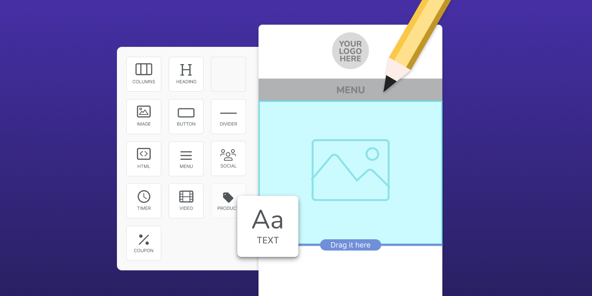
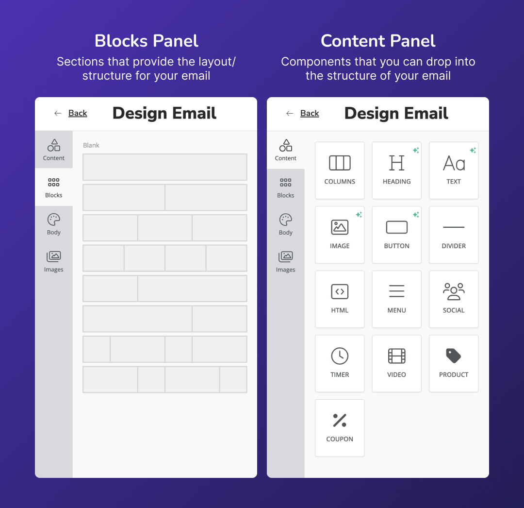
Your email is made up of blocks and content, both of which you can access via the tabs along the main editor sidebar on the left.
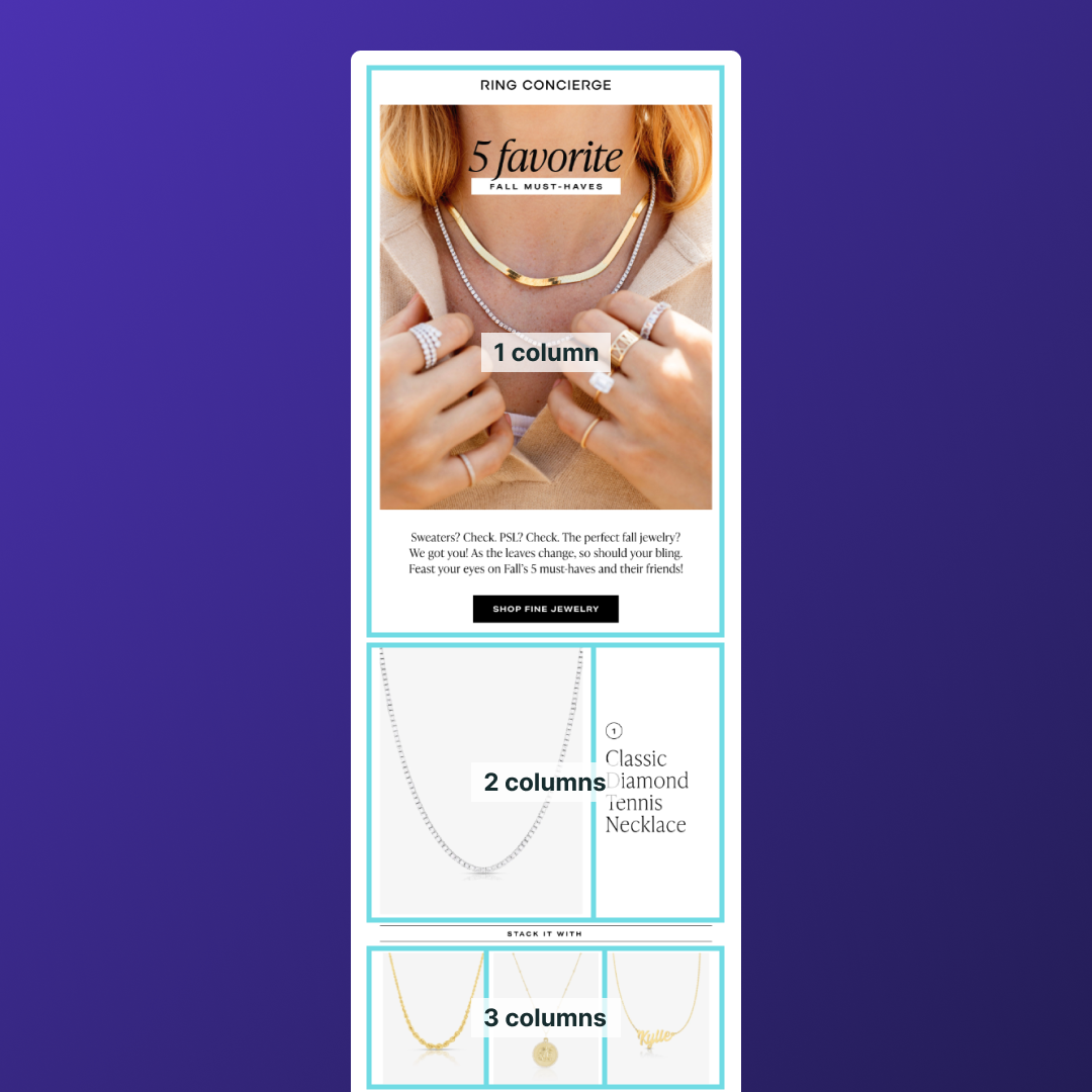
Blocks provide structure – they’re basically the bones of your email. The whole block can also be referred to as a “row” and is made up of one or more vertical “columns.”
Content refers to any of the elements that go within the blocks (text, images, buttons, etc.).
Setting up columns:
As you can see in the image above, you have several options when you go to add a block to your email. You can add as many columns as you want to a block (though in most cases the maximum you’ll want is probably 4). So the options for the structure of your email are pretty much limitless.
To change the width of a column, select the block and hover over the line between columns. Then you can click and drag to change the width. The editor will automatically reflect the percentages of each of the columns as you make these changes.
Padding:
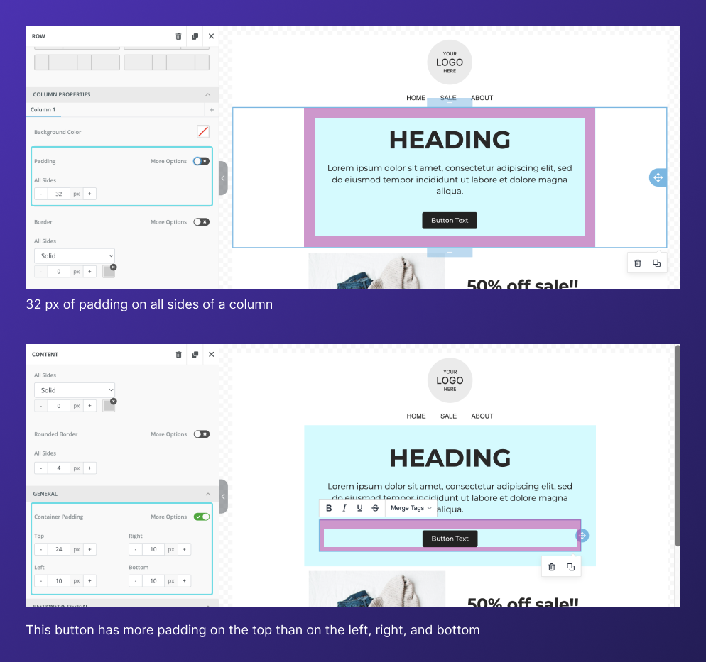
Padding is used to create space around and between your content. You'll see in the editor that you can edit padding on both a column and content level – so you’ll be able to create space around the perimeter of everything that’s placed in a column, but also between each of those individual pieces of content.
If you don’t want to apply equal padding around all 4 sides of a column/piece of content, click the “More Options” switch. This will bring up a separate input for each side.
Incorporating white space into your emails is a super important factor in getting your message across clearly and ensuring that readers are directed to the most important information. So definitely take the time to make these adjustments and make sure that the information in your emails flows intuitively.
Global Design Settings
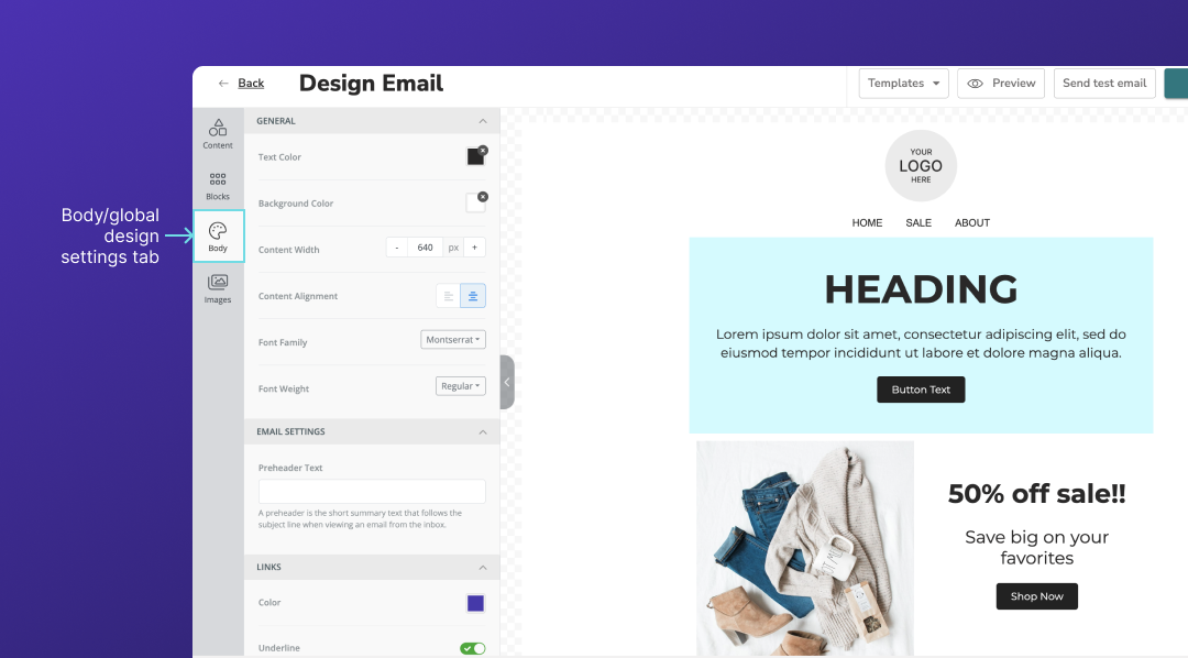
In the left sidebar below “Content” and ”Blocks,” there’s a tab titled “Body.” This tab allows you to control the global settings of your email that every piece of content will default to. You can set overall background and text colors, choose a font family and weight, and adjust the content width and alignment.
After choosing these options, you can always go in and change any settings on a block and content level. But presetting these options at the beginning of your email creation can save you some clicks as you build out the rest of your email.
NOTE: If you’ve already set your company branding in your Privy account, you probably won’t need to make those adjustments for each email. Check out this help doc for more information on how to manage your brand settings in Privy.
Background Options
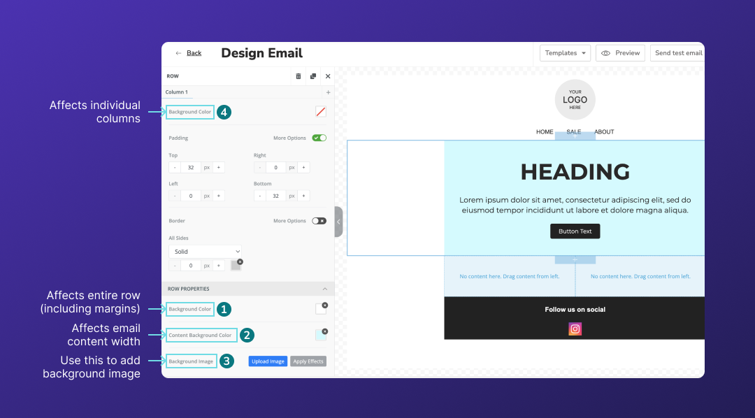
When you click into a block, you’ll see a few separate options for background colors. This can be a bit confusing, but basically boils down to this:
- Background Color (the first option below Row Properties) refers to the very back layer of your email – so this will be applied past the body of the email, all the way to the margins.
- Content Background Color (just below the previous option) is the color of the center portion of the email. If you leave this blank, your whole email will be the background color that’s set in the previous input.
- Background Image is another option here if you’d prefer to have an image in the background of your email. If you select “Full Width” it will extend past the body of your email. If you select “Content,” the image will be constrained at the margins. In order to make a background image visible, make sure to set the content background color as transparent – otherwise it will appear above the image and block it out.
- Additionally, there’s an option to add background color under Column Settings. This is helpful if you’re looking to set multiple columns as different colors. The column color sits in the very top layer – so if you set this, you may block out content background color/background image.
 Background color best practices:
- Keep everything cohesive and choose colors that fit well with your branding.
- Make sure your background and text colors have an adequate amount of contrast to ensure legibility. You can plug your color values into a contrast ratio checker to double check this.
Images
Guidelines:
If you’re creating imagery using a third party tool like Canva or Figma, there are a few considerations that you should be aware of. Your images should be:
- .png, .jpg, or .gif file types
- Less than 1 MB (Privy will accept up to 5 MB, but smaller is generally better)
Take a look at this knowledge base article for more details on image specifications.
Setting text on top of an image within Privy:
While you can’t overlap separate pieces of content in Privy, you can accomplish this effect by changing a block’s background image. Here’s how to do that:
- Add a single column block to your email
- Select that block and navigate to “Background image” in the left sidebar (under “Row Properties”)
- Upload your desired image
- Under “Container width” select “Content” to constrain the image to the body of your email (unless you want it to bleed into the margins)
- Add your content to the block and style accordingly
- Adjust padding of the block and content until enough of your background image is displayed. You may also want to adjust the position of the image as well.
- Now, you’ll want to go into the mobile version of your email and check to make sure the background image still looks okay. You may need to adjust text size/padding.
Note: You’re also able to add text on top of an image using the “Apply Effects” tool, but the range of available fonts is limited.
Stock image library:
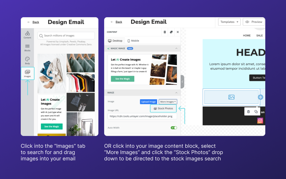
You can add professional-looking, royalty-free images to your emails from right within Privy. Navigate to the “Images” tab in the sidebar or click on “More Images” > “Stock Images” from within an image block. You’ll be able to search for specific images and find options from sites like Unsplash, Pexels, and more without ever navigating out of the Privy editor.
Editing images within Privy:
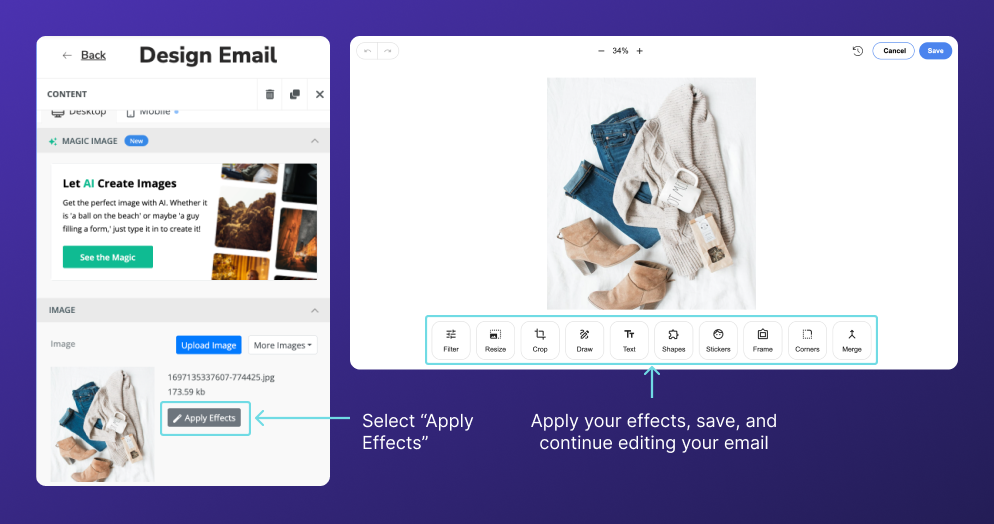
If you’re looking to crop, resize, or make other adjustments to your images without using a third-party tool, you can do so in Privy’s image editor. Simply select your image and navigate to “Apply Effects” in the editor panel. This will bring you into the image editor, where you can crop, resize, filter, add text over top of an image, and more.
Button Styling
Settings:
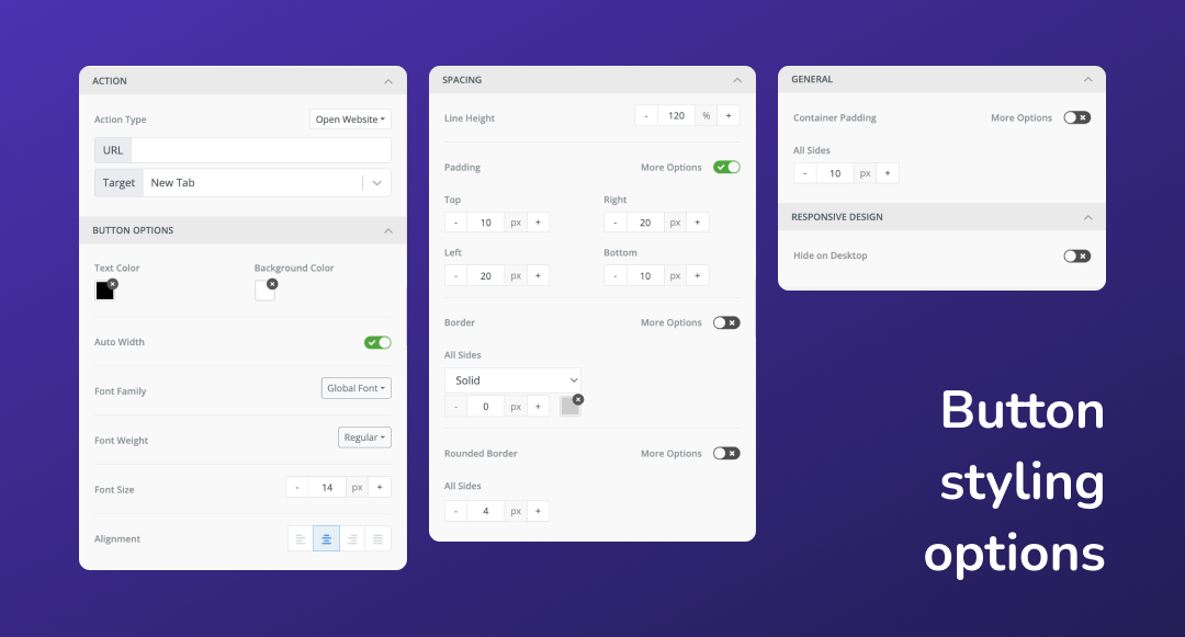
There are a ton of options when it comes to styling your buttons in the Privy editor, making it super easy to create on-brand, eye-catching calls to action (CTAs). You can customize your background and text color, outline, corner roundness, sizing, and more. While the design choices you make for your buttons are unique to your brand, here are some best practices to follow as you style your buttons.
Placement:
Be sure to have a call to action above the fold (before users have to scroll) in your email. The further your audience has to scroll to find something to click on, the less likely you are to get those clicks.
Colors:
You want your buttons to stand out, so this is a great opportunity to utilize some color. When choosing your button colors, though, it’s important to take accessibility into account. You’ll want to make sure your text has an adequate amount of contrast to ensure that it’s legible. A quick and easy way to make sure your contrast ratio is sufficient is by plugging your color values into a contrast ratio checker.

Sizing:
Buttons should be big enough to stand out in your email, but not so big that they’re obtrusive. In addition to being able to change the font size, you can control the padding around the text of your button.
The padding in the container around your button is important here too – you want to make sure that your CTAs stand out from the rest of the content in your email.
Positioning:
You have the options to left, center, or right align your buttons, as well as to make the button stretch the full width of your email (unchecking “Auto width” allows you to control this). There are no real rules for this, but you’ll want to make sure that your buttons fit the flow of your email. So if your text is mainly centered, you’ll probably want your button(s) centered as well. And same goes if your text is left-aligned.
Text:
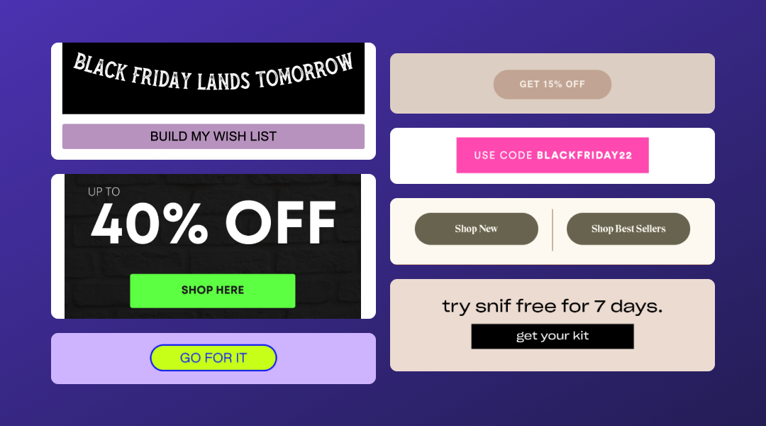
Use precise, actionable language to encourage readers to engage with your CTAs. Avoid long phrases in your buttons – 2-3 words is ideal, and 5 words is the longest you’ll want to go in most cases. Here are some examples of phrases you can use in your buttons:
- Shop now
- See deals
- Start saving
- Get your discount
- Get 15% off (or other percent)
- Use code: [coupon-code]
Optimizing for Mobile
Over half of users prefer to read emails on their mobile devices (source). Which means that your emails need to look just as good on a phone as they will on a desktop.
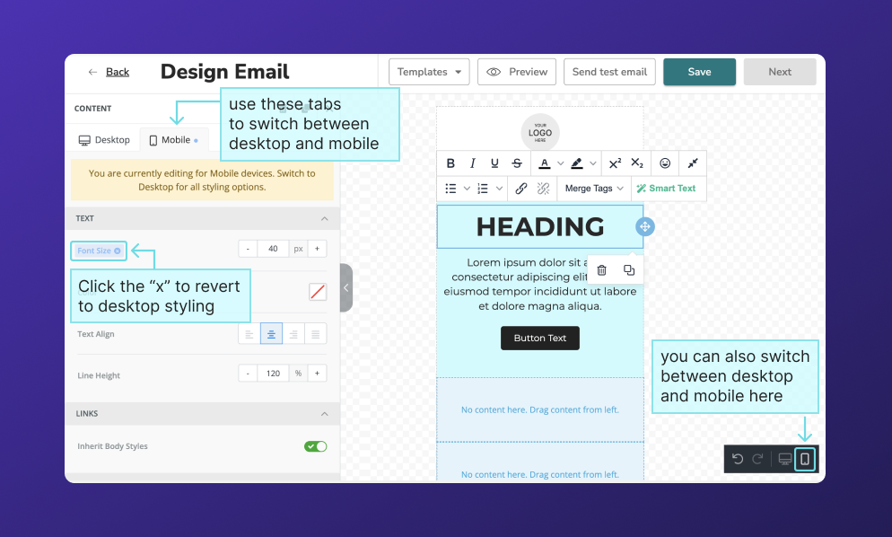
To edit your template for mobile, click on the “mobile” tab at the top of the editor sidebar, or the phone icon in the lower right hand corner of the screen.
The email width will automatically adjust, causing some elements to shift. However, the sizing of your email elements won’t automatically scale down, so you may need to make some manual adjustments.
Editing the mobile version of your email:
You can make mobile-only edits to the following aspects of your email:
- Text size/alignment/line height
- Button text size/padding/alignment
- Image width/alignment
- Section padding
- Content padding/alignment
Once you’ve made a mobile-only adjustment to one of these conditions, it will appear with a blue highlight. Clicking the “x” on this highlight will revert styling adjustments to the desktop settings.
Hiding an element on mobile or desktop:
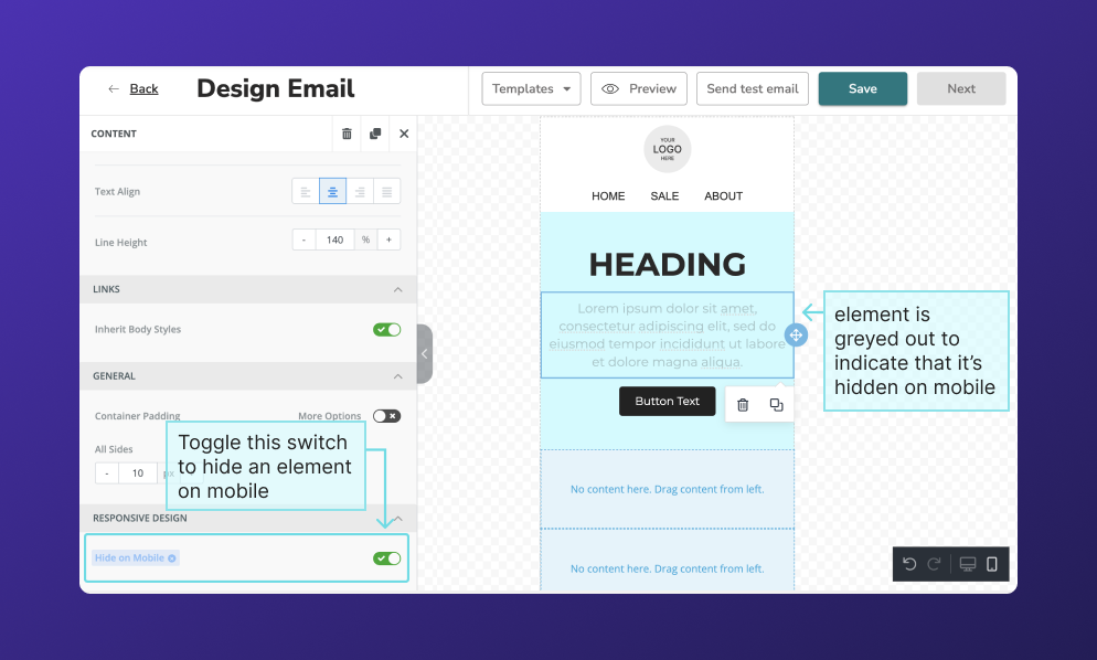
Some adjustments like changing a color, font, or adding a piece of content WILL affect the desktop view. You may want to toggle back and forth between mobile and desktop view a few times as you edit to make sure that you’re not affecting design choices you made previously. If you want to add an element that only appears in mobile (or one that only appears on desktop) you can find this option under “responsive design” at the very bottom of the editor panel.
Stacking vs. not stacking on mobile:
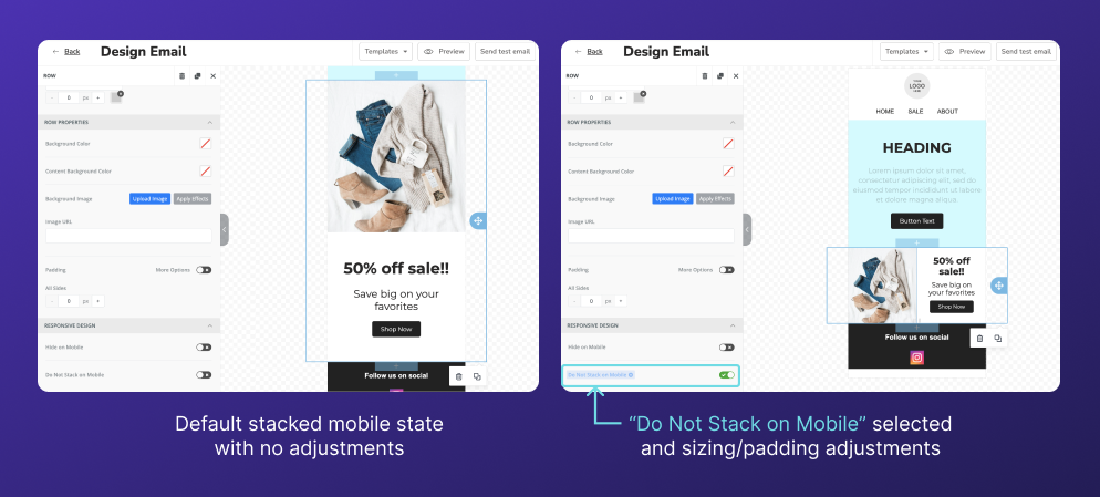
If your email contains sections with multiple columns, the default mobile orientation will be to stack columns from left to right. If this isn’t ideal for your email design, scroll all the way to the bottom of the editor sidebar and click the switch labeled “Do Not Stack On Mobile.” Now these columns will remain side by side instead of stacking. From here, you can adjust the sizing of your text and row/content padding to make everything fit properly.
Finally, before you hit send...
Once you're happy with your design, here are a few things to triple check before you send or schedule your email:
- Your email is optimized for both desktop and mobile views
- Images, CTAs, and menus all link to the right places
- You’ve sent yourself a test email, and checked it on both your desktop and a mobile device
I hope this helps! If you have any additional questions about creating emails in Privy, send them over to marketing@privy.com.
And if you’re looking for inspiration as you design your next email, check out our swipe files. Here you’ll find tons of email examples for different email types, holidays, and even Black Friday/Cyber Monday-specific campaigns.
Subscribe for Updates
Get our best content on ecommerce marketing in your inbox 2 times a week.

Written by Anna Smith
Anna joins the Privy Marketing team straight out of Northeastern University, where she had co-ops at the Wilbur Theater, Dana-Farber Cancer Institute, and OpenView. When she’s not designing, she’s probably painting or doing anything that involves live music, food, or best-case scenario, both.
Subscribe for Updates
Get our best content on ecommerce marketing in your inbox 2 times a week.


.jpg)
