Ecommerce Navigation: How to Get More Eyes on Your Products
8 min read time
Published on May 19, 2022
Written by Lauren Hall

People who show up on your ecommerce store’s homepage don’t usually get there by accident. They were attracted by an ad, a Google search, or are a return visitor.
But what happens if they show up and can’t find what they’re looking for?
They just leave empty-handed. And all the effort you’ve spent getting people to your store goes to waste.
So, how do you make sure the people that pay your online store a visit find everything they came for? By building clear, logical, attractive ecommerce navigation.
Ecommerce navigation is the structure of an online store that helps guide visitors to the products and experiences they hope to find. It includes menus, product filters, and lateral navigation like “people also bought” links.
Online shops that make product discovery easy and fun will be rewarded with higher conversion rates and more repeat visitors.
Creating the ideal path from home to product page for every visitor can feel a little overwhelming. Luckily, many successful brands show off ecommerce navigation best practices on their websites. This means you can quickly learn the not-so-secret tactics of the best in the online business.
Get our best content on ecommerce marketing in your inbox 2 times a week
Make parent categories clickable
It’s important to help move buyers from the front page to a relevant product page quickly. But it’s also important not to push shoppers too quickly into narrow pages that don’t allow for discovery.
One way REI helps shoppers discover more products is by making each parent category on their main product menu clickable.
-1.png?width=821&name=image%20(11)-1.png) Let’s say a visitor is interested in backpacks but isn’t sure if they want a really big one for overnight trips or a smaller one that costs less. They don’t have to make that decision right away. REI lets them click on the general “backpack” header and see all styles on one page.
Let’s say a visitor is interested in backpacks but isn’t sure if they want a really big one for overnight trips or a smaller one that costs less. They don’t have to make that decision right away. REI lets them click on the general “backpack” header and see all styles on one page.
Use SEO-friendly category titles
Category and sub-category titles have to be understandable by both site visitors and Google. Overly clever titles will confuse potential buyers and leave your store languishing on page 12 of search engine results pages.
But sometimes, product categories can have more than a straightforward name. Local lingo or industry-speak (think: “pop” vs. “soft drink” vs. “soda”) can confuse the issue.
Take Wayfair, for example. The company had to choose between the terms “sofa” and “couch.”
-2.png?width=1487&name=image%20(12)-2.png) If you were in the company’s shoes, you could do a few things to make the choice:
If you were in the company’s shoes, you could do a few things to make the choice:
- Look at the terms people search for on your ecommerce site
- Use Google Ads (formerly AdWords) to find the most popular synonyms
- Check out competitor sites to see which term they use
No matter what, though, make sure you’ve picked a category title most people would understand. “Padded nap benches” probably wouldn’t help Wayfair customers find their next living room set.
Choose the best location for navigation menus
Before a visitor can find their next purchase, they need to find your navigation menu. So, where you place your menus is an important decision.
GoPro sells cameras, accessories, and a few other items – not a giant catalog. It’s easy for the company to list its parent categories across the top of its desktop homepage.
-1.png?width=1574&name=image%20(13)-1.png) By contrast, Guitar Center sells hundreds, maybe thousands, of products. They’re organized in too many categories to reasonably fit at the top. So, the music store’s menu appears along the left side. Since most English speakers view pages from left to right, that’s also a good option.
By contrast, Guitar Center sells hundreds, maybe thousands, of products. They’re organized in too many categories to reasonably fit at the top. So, the music store’s menu appears along the left side. Since most English speakers view pages from left to right, that’s also a good option.
-1.png?width=1580&name=image%20(14)-1.png) Use the same information (that people scan left to right, top to bottom) to order your categories in the menu as well. Place the most popular or important items at the top or left.
Use the same information (that people scan left to right, top to bottom) to order your categories in the menu as well. Place the most popular or important items at the top or left.
Use intermediary category pages for large catalogs
For stores with very large catalogs, a single menu with all the categories listed can be overwhelming for a shopper. It’s a problem Lego – which sells thousands of building sets – knows well.
Here’s how the company solved it. When a visitor clicks the “Animal” link in the main menu, they’re sent to this intermediary category page.
-1.png?width=1514&name=image%20(15)-1.png) This gives the shopper a chance to browse several subcategories without scrolling through a huge list of products or searching a single, overwhelming menu.
This gives the shopper a chance to browse several subcategories without scrolling through a huge list of products or searching a single, overwhelming menu.
Intermediary category pages can be designed for particular personas as well. So you can personalize pages for specific shoppers.
Place products everywhere they're expected
One of the benefits of an ecommerce store is that you can place products in several locations. So, if end tables fit in with office furniture, next to sofas, and are grouped together as a category of their own, you can do that online. That wouldn’t work in the limited space of a physical store.
Dick’s Sporting Goods takes advantage of this cyberspace benefit on its website. For example, if you want water bottles, you can find them bundled with general accessories, in the health & wellness category, and alongside other sporting equipment.
-1.png?width=1575&name=image%20(17)-1.png)
-1.png?width=829&name=image%20(18)-1.png)
-1.png?width=720&name=image%20(19)-1.png) All of those links may end up going to the same product pages – and that’s OK. The point is that a buyer can find the bottle they want no matter where they think it belongs.
All of those links may end up going to the same product pages – and that’s OK. The point is that a buyer can find the bottle they want no matter where they think it belongs.
Add sales, new, and bestseller categories
Not every visitor to your website has a product, or even category, in mind. Some just want to get a discount. Others want to see what’s new.
Clothing brand Everlane uses dedicated menu links to help bargain hunters and trendsetters get right where they want to go.
-1.png?width=1547&name=image%20(20)-1.png) As an added bonus, these links give repeat customers a reason to return to your shop. Sure, they may know exactly where to find their favorite tankini, but they’re never sure what’ll show up on the Hot Deals page.
As an added bonus, these links give repeat customers a reason to return to your shop. Sure, they may know exactly where to find their favorite tankini, but they’re never sure what’ll show up on the Hot Deals page.
Crosslink with suggested, similar, add-on products
Once someone reaches their destination, they’re not likely to go back to another menu right away. But there are other ways besides menus to help people discover more products on your site.
Williams SonomaWilliams Sonoma mixes it up with cross-navigation links on its product pages. Through these links, the cookware seller shows shoppers complementary, alternative, and crowd-sourced products, so they can continue their exploration.
-1.png?width=1473&name=image%20(21)-1.png)
-1.png?width=1437&name=image%20(22)-1.png)
-1.png?width=1160&name=image%20(23)-1.png) A couple of tips to follow in William Sonoma’s footsteps: First, make sure the add-on products you suggest fit the original – no one wants to buy an item that doesn't fit with what they're already planning to purchase.
A couple of tips to follow in William Sonoma’s footsteps: First, make sure the add-on products you suggest fit the original – no one wants to buy an item that doesn't fit with what they're already planning to purchase.
Second, keep each category of cross-navigation links well separated on the page for clarity.
Offer a smart search box
On-site search bars are convenient shortcuts for buyers with a high intent to find and purchase a specific product. They’re especially useful for stores that sell a wide range of products.
Hayneedle maximized the conversion capacity of its search bar in a few ways. First, the company added an autofill feature to increase the odds of a successful search – a tactic SpyFu says can boost sales by 24%.
-1.png?width=1589&name=image%20(24)-1.png) Then Hayneedle included links to the parent categories each relevant product belongs to. A quick click and the shopper is perusing coffee tables to their heart’s content.
Then Hayneedle included links to the parent categories each relevant product belongs to. A quick click and the shopper is perusing coffee tables to their heart’s content.
Finally, the store made sure its search bar could respond to incorrect spellings. So, when someone accidentally types “chiar,” they’re not out of luck.
Upgrades like these reduce the chance that a visitor lands on the ultimate dead-end: a “no results found” page.
Give visitors navigational breadcrumbs
Ideally, you never want to leave a visitor stranded on a dead-end discovery mission. If you do, they’ll have to either rely on their browser’s back button to retrace their steps or start all over at the home page.
Being a tech company, it’s no surprise that Newegg uses a more elegant solution in the form of navigational breadcrumbs.
-1.png?width=1562&name=image%20(25)-1.png) In ecommerce parlance, breadcrumbs are a secondary form of navigation that shows website visitors where they are in relation to the rest of the site. Breadcrumbs create a reverse menu of links to the parent and sub-category menus higher up on the website’s hierarchy.
In ecommerce parlance, breadcrumbs are a secondary form of navigation that shows website visitors where they are in relation to the rest of the site. Breadcrumbs create a reverse menu of links to the parent and sub-category menus higher up on the website’s hierarchy.
Newegg has another reverse navigational trick up its navigational sleeve. The company collects all of the product pages you visit and makes them available in a browsing history link.
-1.png?width=1571&name=image%20(26)-1.png) The history link is in a sticky menu, so it’s always accessible no matter how far down the page you scroll.
The history link is in a sticky menu, so it’s always accessible no matter how far down the page you scroll.
Capture more conversions with email
Once you’ve led a shopper to their ideal product, it’s time to turn one-time buyers into long-time customers with a smart email marketing campaign. Use a well-timed series of welcome, post-purchase, follow-up, and cross-sell emails to offer discounts and the latest products to your newest brand fan.
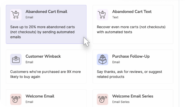
If sending regular emails feels overwhelming, start small by creating a welcome email using Privy’s drag-and-drop editor and template library. Then automate the sending process with Privy’s unlimited email sends. With just a few minutes’ time, you’ll have more opportunities to delight your customers and bring them back to navigate your store once again.
And don't forget about popups to make sure you're capturing emails from site visitors. Luckily, Privy is your all-in-one solution for popups, email marketing and SMS. Get started today for free.
Subscribe for Updates
Get our best content on ecommerce marketing in your inbox 2 times a week.

Written by Lauren Hall
Lauren is a Brand Marketing Associate at Privy. She's the brains behind all things content. When she's offline, she's obsessing over her Bernedoodle pup, Monster, and plotting ways to being a full-time Vermonter ASAP.
Subscribe for Updates
Get our best content on ecommerce marketing in your inbox 2 times a week.


.jpg)


