10 Types of Product Photos You Can Take With Your iPhone
9 min read time
Published on Jul 5, 2022
Written by Chaitra Radhakrishna
 Photos are one of the first things you notice when you land on a product listing for an ecommerce brand. That’s because your brain processes images 60,000 times faster than text.
So when the customer lands on your website, they are unconsciously forming their first impression based on the images. People buy from brands they trust and if the photos are poor quality, then it's hard to build trust and connect with your customers.
You get only one chance to make a first impression. And if the images don't impress, you could be losing out on some serious sales as an ecommerce business.
Get our best content on ecommerce marketing in your inbox 2 times a week
And it’s not just that. The better your product photography is, the higher the perceived value of the products you're selling is. I mean, they say not to judge a book by it's cover, but that's exactly what we do as people.
Eye-tracking studies show that store visitors are first engaged by visual elements, which makes them more likely to stick around and explore the site if yours are top notch. The quality of the images will define this first interaction, the perceived value of your products, and your brand image.
We’ll dive deeper into the 10 types of product photography we think every brand should have. Here’s a quick summary so you can skip ahead if you want!
What are the 10 types of product photos?
- The White Background Shot: Your product shot against a plain, white background
- The Studio Shot: Your product shot against a plain background
- The Mannequin Shot: Gives depth and shape to your clothes and accessories
- The Lifestyle Shot: Showing your product in use
- The Action Shot: Showing your product in motion and is less stylized
- The Detail Shot: Close up shots to highlight features
- The Scale Shot: To give your customers a sense of size
- The Group Shot: Multiple products shot together (bundles)
- The Packaging Shot: Your product styled in a branded way
- The Process Shot: To tell the story behind your product
1. The White Background Shot
The white background shot is exactly as it sounds — it’s your basic eCommerce product photo against a plain, white background. This no-frills shot keeps all the attention on the product itself, without any distracting background images competing for views.
And that’s precisely the appeal of a white backdrop for product photos.
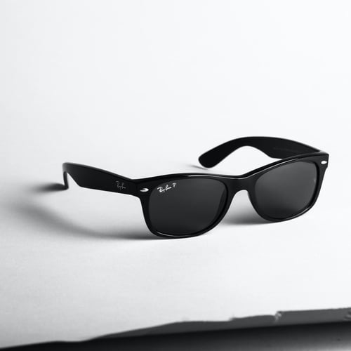 The white reflects light and draws shoppers to the product. It also helps the details pop, something you definitely want on ecommerce product listings.
The white background also makes retouching and editing a breeze since it’s a solid color and limits shadows. When in doubt, use a white background for your product photography.
2. The Studio Shot
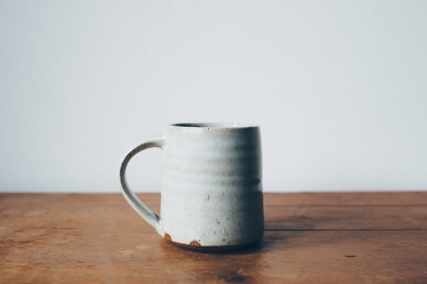
The studio shot is just your product photo taken on a plain background and nothing else. The purpose of this shot is to clearly and attractively present your product to your customers. As you can see in the example below, the studio shot is super simple. Clarity is the only thing you need to focus on here.
Studio shots are most commonly used on product pages. You want shoppers to be able to see exactly what could be theirs.
But beware, gone are the days of the typical fake-white background product photos. Today, customers like to see more on-brand, yet clear studio shots of the product. Choosing backdrops that match your brand can go a long way in creating brand recognition.
3. The Mannequin Shot
The ghost mannequin or invisible mannequin shot gives shoppers an idea of how your clothing or accessories fit.
This shot is filled out like someone placed these items on a mannequin, but you won’t find any arms or a head, just the product itself. That’s a mannequin shot, which is also sometimes called the ghost mannequin or invisible mannequin.
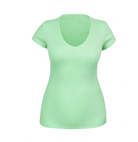 The mannequin shot allows shoppers to envision what the article of clothing will look like on a real human without being distracted by a weird-looking plastic mannequin or a model who doesn't look like them.
It also helps customers better envision how the product will fit on them. They can clearly see how the garment lays, how long or short it may be, where details fall against the body, etc.
It’s the perfect visual when shoppers can’t hold up your products against themselves in person.
Mannequin shots breathe life into clothes that would otherwise lay flat and be hard for shoppers to imagine working for them. That’s why they’re a must-have for eCommerce clothing brands looking to increase conversions.
Once people can envision how awesome they’ll look, they’ll be more likely to buy your product.
4. The Lifestyle Shot
The lifestyle shot gives your customers a glimpse at what their life may look like if they purchased and used your product. You simply place the product in its natural environment to give people an idea of how to use it.
Like mannequin shots, lifestyle shots help customers imagine what using the products in their work or home would mean for them. They create a relationship and connection with your audience, which is why they’re so essential.

Lifestyle shots are most commonly used on your website and social media posts. The best ones evoke that fear of missing out (FOMO), like in the image above.
5. The Action Shot
The action shot takes the lifestyle shot a step further to highlight your product in motion or in use to demonstrate how it works.
Action shots are popular with fitness, health, and lifestyle ecommerce brands. They allow shoppers to picture themselves doing exactly what they’re seeing with the product.

Just like with the mannequin and lifestyle shots, people see themselves in the image, starring alongside your bold, powerful product. That kind of imagery makes connections and conversions.
Once they make the connection that your product can help them run faster, climb higher, cook better, clean up easier, etc., they’ll be much more open to buying and trying it for themselves.
6. The Detail Shot
The detail shot is a close up shot of the product. This shot helps customers understand and see the details of your products. Here you can see the candle in much more detail.
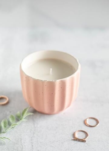 The purpose of the detail shot is to take away any confusion or answer any questions that the customer might have about the product. This will make it easier for them to make a buying decision.
7. The Scale Shot
The scale shot is a photo of the product that shows how big (or small) the product is relative to its environment. Before you buy something in a brick and mortar store, you interact with it, but when it comes to shopping online, you don’t have that option, so you have to make it as clear as possible in your photos. There’s nothing worse than placing an order for something and it’s half the size you expected it to be when it shows up.
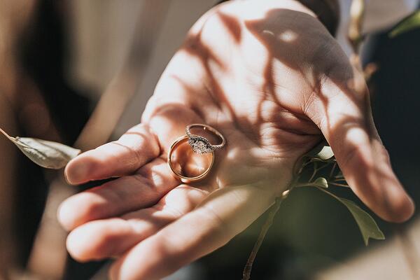 Your customers want to know if that hat fits an infant, or if it’s meant for adults. If the vase can hold a full bouquet, or just a few flowers. You get the idea.
8. The Group Shot
Group shots are great for showing products that are sold in multiples or different variations like jewelry (available in different finishes) or ceramic mugs available in different colors.
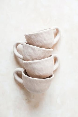 Grouping can help depict depth, variations, finishes and angles of a product in one captivating image.
9. The Packaging Shot
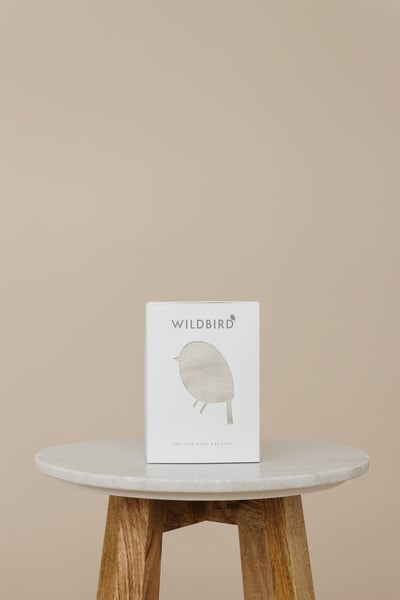
Packaging is definitely one thing that adds that extra oomph to the ecommerce shopping experience. So if your product packaging is gorgeous, why not show it off on a packaging shot?
Knowing how the product is packaged gives customers a better sense of the branding and what to expect in the mail. Additionally, a beautiful packaging shot can also help convey that the product makes a great gift. It's a win-win!
Packaging shots are most commonly used on product pages (or anywhere on the site, really) and for social posts.
Here’s a beautiful packaging shot from WildBird.
10. The Process Shot
The process shot can be used to emphasize the level of workmanship that went into creating a particular product. So if you are a handmade seller or designer that makes their own products, showing the process behind how it's made can be incredible in terms of building trust and connection with your customers.
Process shots are most commonly used on product pages and social.
Here’s a process shot of a pottery maker.

Bonus: Get product shot with user-generated content
Sharing user-generated content (UGC) is one of the most effective ways to build brand recognition and strengthen your social proof. If customers tag your products on Instagram, make sure to include a shot of that in your product listing. This helps build trust and really influence your customers as they decide to make the purchase.
User generated content is most commonly used on websites, product pages and social media.
Takeaway: You Don’t Need To Spend Thousands To Get Amazing Product Photos
People remember 80% of what they see and just 20% of what they read. So your product photos have a little bit of an advantage when it comes to capturing attention and creating memories about your brand.
They allow you to guide your customers and help them envision what it would be like to have your products in their daily lives.
Because remember: they can’t interact with your products until after they’ve made the purchase. Help them make the buying decision easier by giving them all the information they need so there aren’t any surprises once they receive their package. You want them to be thinking, “This is exactly what I wanted,” not “Oh man, this isn’t anything like what I imagined.”
And you definitely don’t need a fancy studio or a high-end DSLR camera to take stunning product photos. You can take your product photos right from your iphone. This free 5-day email course from Product Photography School will help you learn how.
And pssst 🤫 you can also listen to this episode of The Ecommerce Marketing Show where I talked about all this with Dave.
Subscribe for Updates
Get our best content on ecommerce marketing in your inbox 2 times a week.

Written by Chaitra Radhakrishna
Chaitra is the founder, dreamer and all-hats-wearer here at Pinkpot studio. She thrives helping entrepreneurs craft a powerful visual presence through conversion-focused web design and product photography.
Subscribe for Updates
Get our best content on ecommerce marketing in your inbox 2 times a week.


.jpg)
