The Welcome Popup Playbook That Will Help You Convert 5% Of Traffic
6 min read time
Published on Dec 1, 2020
Written by Lauren Hall
 Many ecommerce marketers measure success in terms of conversion rate — and for good reason!
After all, if at least some of the visitors to your site are becoming users, subscribers, or paying customers, then your business will probably grow over time. If they aren't converting, then you're going to have major problems.
The thing is, most first-time visitors to your site won't end up making a purchase.
So the question becomes: how can you maximize the time they spend on your site, and encourage them to keep thinking about your brand after they leave? Basically: how can you build a relationship with them whether they bounce or not?
Here's the answer: use a welcome popup. It can be a total game-changer for your business.
Get our best content on ecommerce marketing in your inbox 2 times a week
What is a welcome popup?
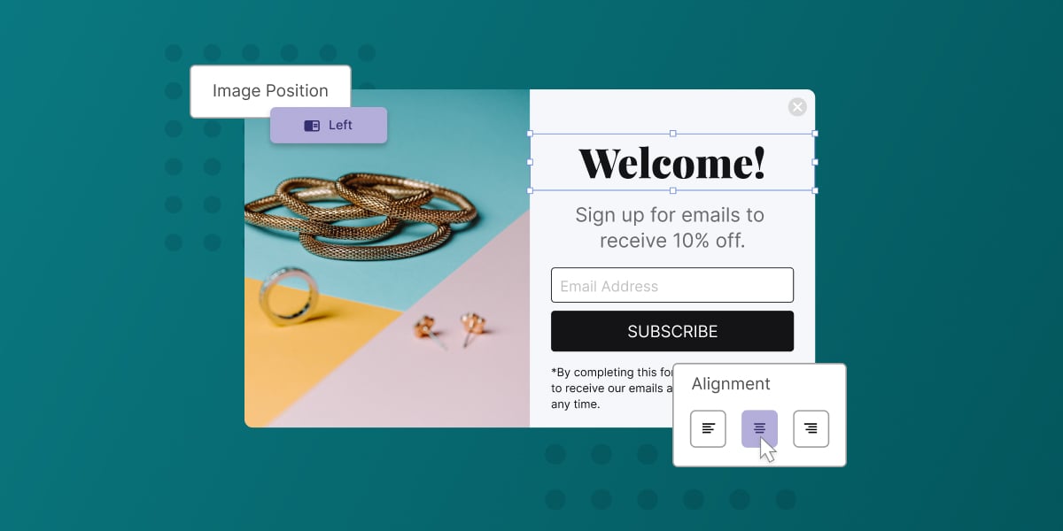
A welcome popup is presented as soon as your visitor arrives, or shortly thereafter. It can come in the form of a bar, a flyout, a banner, etc. The key is that it has to grab the visitor's attention.
So what's the rationale behind the welcome popup?
You already know the vast majority of first-time visitors (at least 97%, if not more) aren't going to make a purchase when they first explore your site.
This means that "second chance business" can be extremely valuable to your company. After all, if the consumer was interested the first time, he or she may be ready to buy the second time around.
Of course, to be able to get that second chance, you'll need to stay in touch with the prospect. That's where email marketing comes into play. You can use email as a channel to drive your visitors back to your site.
So the point of a welcome popup is to capture the visitor's email address so you can keep them engaged with your brand and, fingers crossed, come back to make a purchase.
Why do so many Shopify stores run welcome popups?
Short answer? Because they work!
Popups really took off around 2015, when a lot of the larger brands began investing in them. There were several factors that fed into this decision. For instance:
- A lot of these ecommerce stores were getting a large chunk of their revenue from email marketing. We're talking 40% or more, just from email. Obviously, it makes sense that the more consumers you have in your email list, the more revenue you'll be able to generate.
- Add to that fact how easy welcome popups make it to collect new emails. After all, the consumer is coming to you!
- Plus, welcome popups take away a lot of the "friction" that visitors would normally have if they were willing to give out their email address (scroll down to the right section, click on the right link, and so forth). Following this logic, the big brands doubled down on welcome popups and haven't looked back since.
What makes a great welcome popup?
That's the million dollar question, isn't it? Especially if you're new to the whole welcome popup scene.
So to help you out, we've developed a simple playbook that will help you convert 5% or more of your traffic (the industry standard benchmark).
Here are the 7 main plays that you should run:
1. Use popup as your format. Flyouts, bars, and banners are all great, but if you're a popup novice, we recommend you stick to the classics. You can experiment with different formats after you've mastered the basics.
2. Keep the shape of your popup vertical. It might seem odd, but there's a very significant reason why vertical is often better than horizontal: mobile devices. The reality is, you don't need two separate welcome popups, one for desktop users and another for smartphone users. A vertically-oriented popup should work well no matter what device your visitor is on. Keep it simple, and save yourself some trouble.
3. Target new visitors to the site. When you're first starting out, we recommend that you only target new visitors with your welcome popup. There are ways to generate business from existing customers by using popups, but for now it's best to focus on growing your email list.
4. Don't immediately trigger your popup when the visitor lands on the page. A lot of welcome popups come on screen immediately, almost like an ambush for new visitors. It's not always a bad thing, but it might annoy your prospects. But if you program your popup to show after the visitor's been there for 5 seconds or after the visitor's scrolled 75% of the way down the site, you'll probably get better results. Both of these visitor actions are good quality signals, so you'll likely be targeting a higher-value audience. Plus, it may not be so jarring to your visitors.
5. Include clear, compelling content in your popup. Whether you're offering a discount, newsletter subscription, free shipping for their first order, or a monthly drawing, you need to make it clear what you're offering, and why they should sign up (Of course, we do recommend incorporating an offer into your popup to incentivize new signups).
6. Craft an engaging CTA. Your call to action should be clear, have an action word in it, and indicate to your prospect that this won't be a difficult experience. For example, if your offer is a coupon code for 10% off their first purchase, use the CTA: "Reveal code now." It reassures your visitor that they can get the code immediately upon signing up, and they won't have to leave your site (pro tip: if you make them check their email to get the code, they might get distracted and not come back).
7. Don't overthink the creative side of things. Your first welcome popup doesn't have to be perfect; it just has to be functional.
Don't let yourself be paralyzed by creative anxiety. Just launch one! You can always go back and make it better.
And there it is! The welcome popup playbook that will help you convert 5% of traffic. If you keep the purpose of the welcome popup in mind and follow these 7 steps, you'll almost certainly see an increase in your website conversion rate. And your business will grow as a result.
Subscribe for Updates
Get our best content on ecommerce marketing in your inbox 2 times a week.

Written by Lauren Hall
Lauren is a Brand Marketing Associate at Privy. She's the brains behind all things content. When she's offline, she's obsessing over her Bernedoodle pup, Monster, and plotting ways to being a full-time Vermonter ASAP.
Subscribe for Updates
Get our best content on ecommerce marketing in your inbox 2 times a week.

.jpg)
