How Long Should Your Marketing Emails Be? Perfect Length & Best Practices
14 min read time
Published on Jul 21, 2020
Written by Rachel Waldmann
 Email is arguably the backbone of your entire ecommerce marketing strategy. When done right, email marketing is a surefire way to reach your audience and get them to spend money at your store. Basically, email is your business’ lifeblood.
In fact, Ezra Firestone, CEO of Smart Marketer, estimates that 30-40% of your generated revenue should come from email. From a welcome series to an order follow-up, there are lots of emails you'll want to send to nurture leads and drive conversions.
This article will talk about factors to consider when deciding on email length, and best practices to level up your ecommerce email copywriting game.
Table Of Contents
- How long should your ecommerce email be?
- Three steps to determine email length
- Email length best practices
- The golden rule of email marketing
- Email Length FAQ
Get our best content on ecommerce marketing in your inbox 2 times a week
How long should your marketing email be?
Generally speaking, the sweet spot for marketing email copy is 50-125 words. That said, the truer answer is that it really depends! Hey - I don’t make the rules, but I’m here to help.
There have been tons of studies about ideal marketing email length. One study from Boomerang found that, for optimal response rate, 50-125 words (a few sentences, or one longer paragraph) is ideal. Another, from Constant Contact concluded that the golden number for ecommerce newsletter emails is actually 200 words (or ~20 lines of text), which is shown to have the highest click-through rate.
We work with half a million small ecommerce brands, and our opinion is this: what you say matters more than how long it takes you to say it.
However, that doesn’t mean your email length needs to be chosen at random.
Three steps to determine email length
There are lots of factors that can help you determine the appropriate length and make the most of your email efforts. Here are the three key things to keep in mind when making your decision.
1. Tailor email length based on product or industry
The length of your marketing emails may depend on your industry and type of products you’re selling. For instance, you’d probably need to use more text to explain a new type of product that people aren’t generally familiar with, than you would to market something everyone already knows and understands.
In addition, if there’s a story behind your product that makes it unique from your competitors, it would be wise to share it, and therefore make your emails a little bit longer to accommodate it.
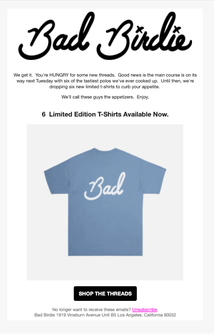
Here are two examples, one from Bad Birdie Golf (short), and one from Piccolina (long). They both serve as an announcement for a new line of t-shirts.
For Piccolina’s kids’ tees featuring female trailblazers, their story and mission is critical to their brand, so they included it, making their email longer. In contrast, Bad Birdie’s story is not nearly as central to their brand’s purpose, so they were able to get their message across with a more streamlined approach.
Bad Birdie Email:
Piccolina Email:

2. Tailor email length based on the target audience
Remember when I mentioned that what you say is more important than how long it takes you to say it? Well, what you say should match what your audience wants (and keep in mind, there’s a difference between what they want, and what you want them to want)!
Use list segmentation to personalize your emails and send the most relevant messages to the right contacts. For instance, your different audiences could include:
- Brand new site contacts who haven’t purchased yet
- Serial browsers who have never purchased
- Shoppers who have abandoned their cart
- Frequent buyers
Readers’ interest in your emails will largely depend on their engagement with your brand, so segmenting based on their shopping behaviors is critical to giving readers what they want.
Take your new subscribers as a perfect example: these contacts don’t know you very well yet. They’ve probably never purchased from your store. They don’t have much emotional investment in your brand, so you’ll want to keep emails to this group shorter.
Now think about your loyal, repeat customers. They know your products and they’re presumably interested in what you have to say, so these contacts may be willing to scroll a little bit to see new products, discounts, or other value your email brings to their inbox.
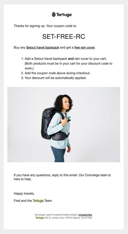
Here are two emails, both from Tortuga. The first is a welcome email for a new subscriber, whereas the second, longer email, is a newsletter with helpful packing tips, received a few weeks later after I had engaged with their brand:
Tortuga welcome email:
Tortuga newsletter:

3. Tailor email length based on email type
Different types of emails serve different purposes (duh), and some will have to be longer than others to get the point across.
Here’s a list of the email types we’ll be explaining in this section:
- Welcome emails
- Abandoned cart emails
- Newsletters
- Order confirmation emails
- Promotional emails
Welcome emails should be relatively short, but captivating. It’s the first time you’re engaging with this potential new customer via email. You want to draw them in but not bore them.
Abandoned cart emails should also be brief; you already lost these customers on the checkout page, so they might not have enough interest in your brand to read a lengthy message. Instead, focus on getting them back, closing the sale, and avoiding looking desperate.
Order follow-up emails can also be pretty short and frequently earn an incredibly high open rate. Everyone loves a status update on their order.
Newsletters with announcements, updates, and new products can typically be longer since your customers will likely expect these emails to be more informative.
This newsletter from Andie is long for a reason – it's announcing five new swimsuit colors, so it makes sense that it would feature each of those new colors. They ensure that the content isn’t tedious by leveraging authentic product photography.

Email length best practices
Now that we’ve covered how to decide on length, here’s some email marketing tips to keep in mind to write that perfect email and improve your open rates
Use sections to break up your email content
If you’re a serial ecommerce email subscriber, you’ve probably noticed a pattern in your inbox: emails are often broken up into sections. Once someone opens your email, you only have their attention for a few precious seconds, and dividing your email into distinct sections makes it more digestible for your readers – regardless of its length.
Make your emails easy to skim with a combination of text and visuals throughout your sections. Color-blocking is your friend. Prioritize the most important information at the top, so it is immediately visible when the email gets opened, even if the viewer doesn’t scroll through. If the value of your email isn’t clear the second the viewer opens it, it’s probably getting deleted.
This example from Ollie immediately packs a punch with its bold header and high-quality photo, followed by social proof, and then, other valuable, but less critical information towards the bottom.
Even if the recipient doesn’t scroll, they still get the gist of their message: Ollie offers nutritious food for every dog.

Your email subject line matters
Studies have shown that of all the variables you can test in your emails, the element with the greatest impact on success is your subject line. Advertising legend David Ogilvy says that on average, five times as many people read the headline as do the body copy. That means that your email’s pretty packaging is at least as important as the email content itself.
Subject lines in the range of ~65 characters (or 5-9 words) tend to be most effective, but there’s no hard and fast rule.
And if writing a killer subject line feels daunting, check out these tips to get you started.
When in doubt, short emails are the way to go!
We know that there’s no “best” length for an email. But if you find yourself really struggling, err on the shorter side. It’s better to keep things simple and pique your readers’ interest on one strong point than giving them information overload.
To keep your shorter emails from looking sparse, supplement your limited copy by adding graphics and product photos. Quality images are invaluable to conveying critical information quickly and making your reader fall in love at first sight with your product and your brand.
When deploying product images, consider these tips to get you started:
- Never have an email that is only composed of images. Sometimes images don’t render, and then your readers are faced with a completely blank email in their inbox, which is confusing and spammy.
- Make all of your images clickable, and include alt-text. Every image is an opportunity to propel your readers into action.
- Include at least a few brand elements, so customers can quickly understand who the email is from. But don’t overdo it – keeping it simple ensures greater probability your email will get delivered, and not trapped in a spam filter.
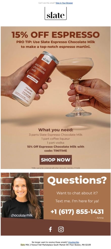
Here’s a fairly short marketing email from Slate. It’s composed almost entirely of one large, beautiful product image, which acts as a clickable CTA directing the reader to their website. There’s very little text, but between the headline and the image, the reader gets all the details they need. Their logo is at the top, but they haven’t overdone it with their branding by adding tons of extraneous elements that distract from the message’s purpose.
Express your brand's personality
Creating emotional ties with your readers builds brand loyalty and can increase engagement rates with your content. Think about it this way; would you be more likely to read a lengthy email from a friend, or from a business? Probably the friend (I hope, for the sake of your friends).
Give your readers incentive to keep scrolling down the page by adding personal elements throughout the email body. A little humor doesn’t hurt either. Have a point of view, so you’re not just another cookie cutter business showing them a product they may or may not want. Make them see the humans behind the business.
Chubbies consistently does an incredible job at this. From their header, all the way down to their unsubscribe text at the bottom, (“Never wanna hear from us again? Dang, that’s harsh, but if you must, you can unsubscribe here.”) their emails ooze personality. There are no generic CTAs or long, dull paragraphs of copy to be found. At every point throughout the scrolling process, the reader will find at least a hint of their playful brand voice; but if they don’t scroll at all, the Cliffnotes version can be found at the top.

Responsive emails for good UX
Most email service providers allow you to see which types of devices your emails are most frequently viewed on. Meet your readers where they’re at by optimizing your email to offer the best viewing experience. A positive customer journey is way more impactful than hitting a particular word count. All of Privy’s email templates are designed to be responsive, so if you’re using our email product, you’re already ahead of the game.
In addition to using a responsive template, use the data you have about your audience’s email habits to make strategic decisions about your content. For instance, if most of your readers are opening your emails on a mobile device, you’ll want to respond by keeping emails shorter and using clear images that will look great on a phone screen. Best practices include:
- Big, beautiful CTA buttons instead of tiny hyperlinks.
- Large, readable text with attention-grabbing headers.
- Placing the most important information “above the fold,” so it’s immediately visible, even on a small mobile device screen.
- Single-column templates that will scale to the device they’re viewed on.
- Sending test emails beforehand and checking them on multiple devices.
A/B test to get your perfect email
We get it – you’re busy. You barely have time to send one marketing email, let alone multiple versions of it. But A/B testing can provide you with invaluable data points that will inform your marketing efforts and generate greater success.
Try sending out two versions of the same email, but change one key element, in this case the length. Try sending a longer email to half your list, and a shorter version to the other half. See what performs better, and you’ll be building your brand with data-backed decisions in no time.
The golden rule of email marketing
When sending ecommerce emails, what you say is far more important than how long it takes you to say it.
There’s no “right” length for a marketing email, but you can choose the most appropriate length by considering the type of email and the intended audience.
Draw readers in with a catchy subject line, then seal the deal with beautiful product images, attention-grabbing, streamlined text, and brand elements. Think about what would gets you to open or click through an email, and remember, your data is your best friend.
It is also important to build your own baseline to determine success by A/B testing your email length.
Email length FAQs
How long should marketing emails be?
Generally speaking most marketing emails are 50-125 words long. Although this is the baseline, the purpose of the email and your brand voice are also key factors to determine how long your marketing emails should be.
Is email marketing still effective?
Email marketing is one channel in your marketing strategy. The effectiveness of email marketing largely depends on having a good understanding of your audience, clear goals for the channel, a solid strategy and sound execution.
How do I decide how long me email should be?
When deciding on how long to make your email length, three things should be taken into account: your product and industry, your audience base, the type of email you are sending. Further to that, you can optimize your email length through A/B testing and using email open rate data to determine what works best for your ecommerce business.
How long should an email subject line be?
Email subject lines are generally 5-9 words ‘(~65 characters). The ideal email subject line should be driven by finding the least amount of words to get your message across, what devices your audience use to engage with your emails, and the type of content in the email.
Subscribe for Updates
Get our best content on ecommerce marketing in your inbox 2 times a week.

Written by Rachel Waldmann
Subscribe for Updates
Get our best content on ecommerce marketing in your inbox 2 times a week.

.jpg)
