Website Conversion List Growth
6 Types of Popups & How To Build A Campaign That Converts
12 min read time
Published on Jun 1, 2020
Written by Rachel Waldmann
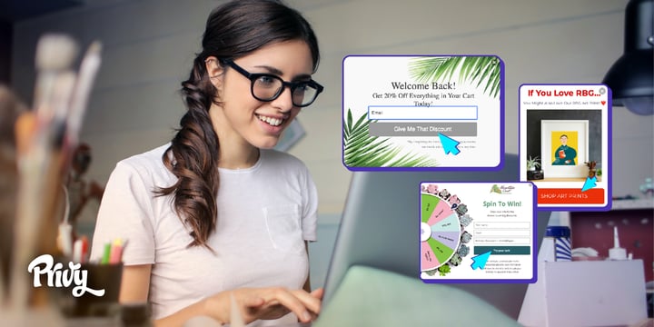 Pop ups are one of the most versatile tools at your disposal – they can be used to collect emails, increase average order value, guide visitors, and lock in sales.
Historically, the term “pop up” has gotten a bad rap for feeling flashy or spammy, literally popping up in the faces of innocent website visitors. But in today’s world where email and SMS marketing present huge opportunities for lead generation, pop ups in the form of a box or bar on your page can actually enhance your visitors’ experience, grab their attention, and encourage them to buy from your ecommerce store.
With email marketing ROI averaging $42 for every $1 spent, it’s no wonder you should be focusing your attention on the foundation of email marketing: list growth. But the only way you’ll be successful is with pop ups that actually get people to sign up. We’ll walk you through just how to make that happen.
Get our best content on ecommerce marketing in your inbox 2 times a week
What is a pop up?
Pop ups are one of the most versatile tools used by digital marketers to increase website conversions on web pages. As an ecommerce business, you can grow your email subscriber list, increase average order value, reduce cart abandonment, remind people to checkout, and lock in sales by using pop ups correctly.
We'll go through the different types of popups and how to use them in this article:
Welcome/Entry popups
Goodbye/Exit popups
Scroll popups
Time-Based Popups
Interaction-Based Popups
Bars & Banners
Different types of pop ups
Before we dive in, let’s get on the same page about the different types of website pop ups (or “onsite displays”) you can play with. This will help you choose the best format when it comes time to actually building your campaigns.
Welcome/Entry Popups
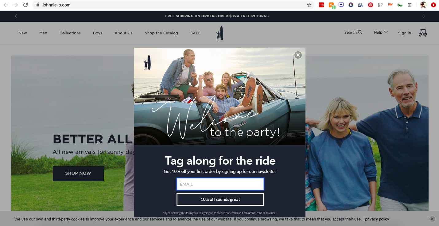
One of the most common onsite display types, a welcome campaign does exactly that – it welcomes the user to your website. This is the pop up you use when you want a user to see it as soon as they visit your page. It should really set the tone for your brand (like the great example below from Johnnie-O) and make visitors want to explore the site further.
Goodbye/Exit Popups
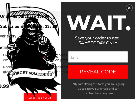
You put in the effort to welcome your visitors, so you probably want them to stick around, right? Exit intent pop ups are triggered when a user moves their cursor towards that pesky close button on your window. These campaigns should be eye-catching enough to change their minds, or at least capture their email before they go, like the memorable example below from Death Wish Coffee.
Scroll Popups
These campaigns are triggered when a user scrolls to a certain point on the page. In this instance, you’re assuming that if they’ve scrolled a bit, their interest is piqued (makes sense, right?). So once they’ve sniffed around, it’s time to strategically reel them in.
Time-Based Popups
Similar to scroll-triggered pop ups, time-based ones are designed to capture visitors who have shown interest in your site by remaining on a page for a certain amount of time. You may trigger the pop up to appear after 10 seconds, 30 seconds, or longer. Remember to give first time site visitors a bit of time to explore and avoid making the timeframe too short!
Interaction-Based Popups
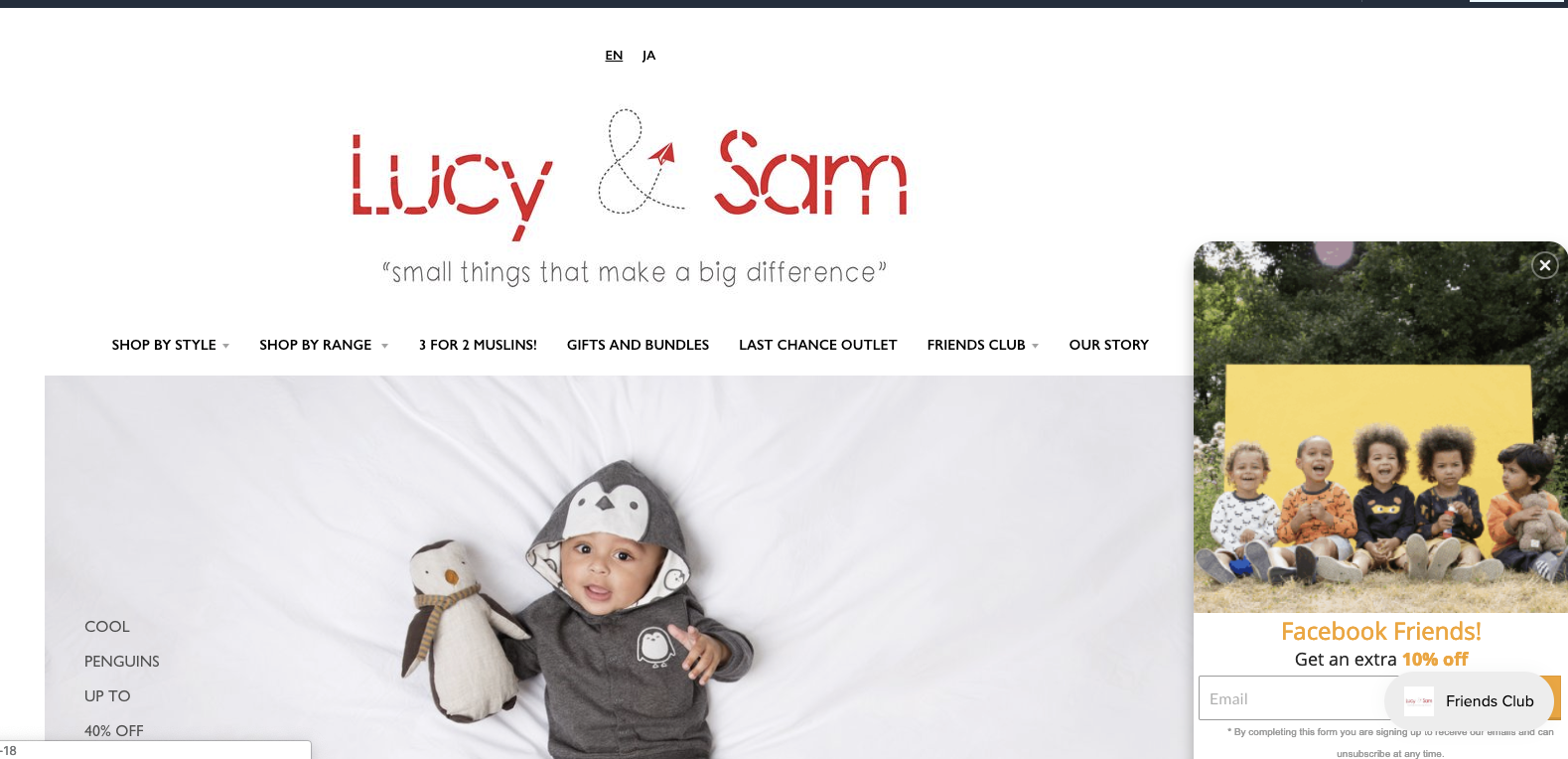
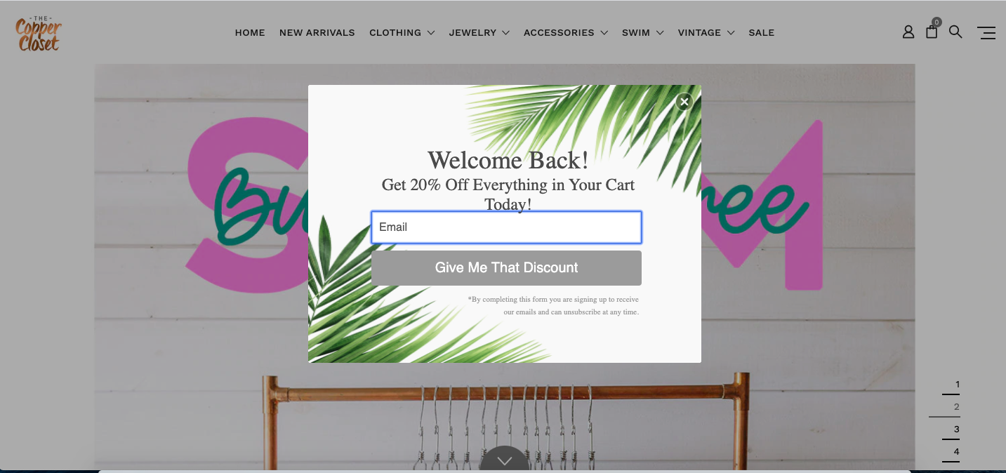
This behavior-based pop up is triggered after a user has visited a particular page or product. It may display an offer specific to the types of products they appear to be interested in, or a pop up that recognizes where the person came from, like the example from Lucy & Sam. Alternatively, it may be a “welcome back” campaign for a user who has visited before, acknowledging that they’re already familiar with your brand, like the one below from The Copper Closet.
 Bars & Banners
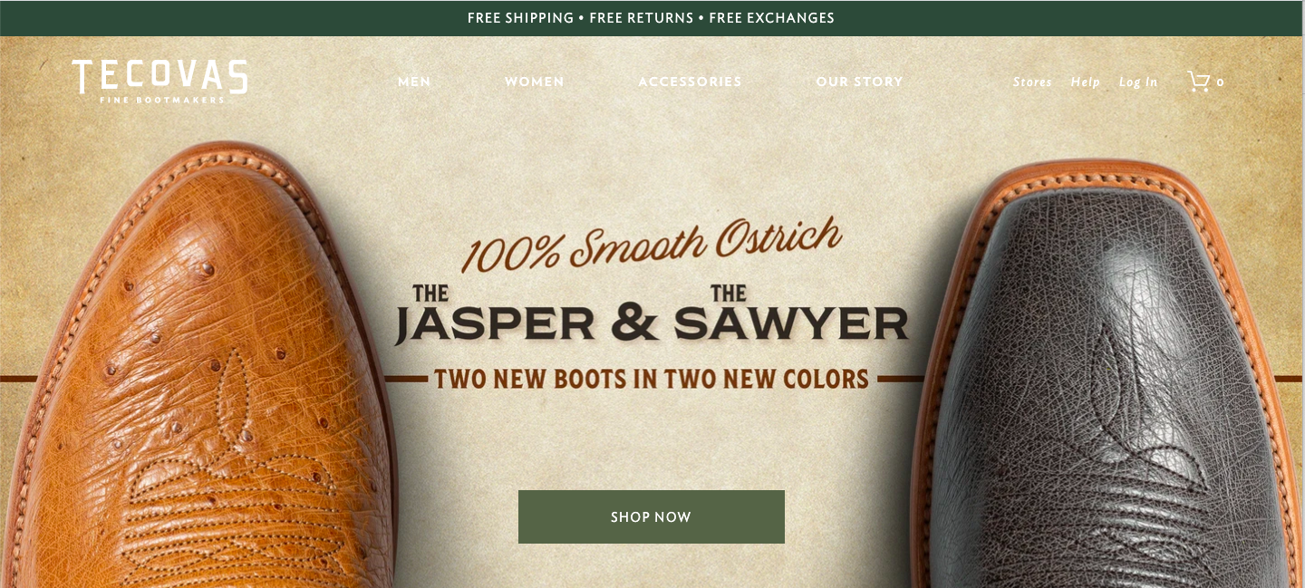
This type of campaign is unique in that it is far less intrusive than other types of campaigns, often appearing at the very top or bottom of a page. Bars are most frequently used when there’s an offer you want shoppers to keep in mind throughout their experience, like free shipping or a discount. Tecovas uses a bar to display free shipping, free returns, and free exchanges; it’s a long-term offer that’s part of their policy, and it’s one that will be relevant and enticing to most shoppers.
Pop up best practices
Use the right format
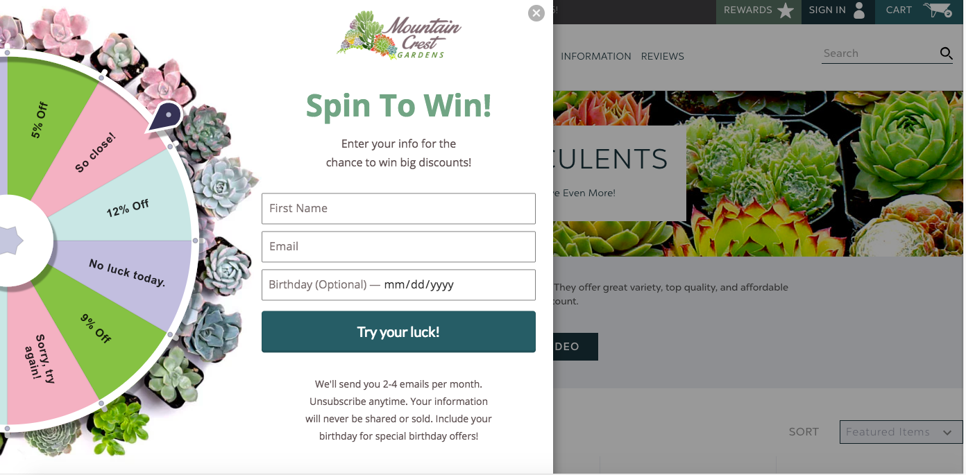
Use different pop up formats to craft the most appropriate display possible. For instance, classic pop ups (a box or full-screen pop up) would be ideal for a welcome campaign or exit intent. Spin to win displays, like the one below from Mountain Crest Gardens, are also a fun way to gamify a welcome campaign and start things off on an exciting note.
 Fly-outs, on the other hand, are boxes that pop up from the corner of the page, and are best used for cross-selling or upselling while a visitor is browsing through a product page. This example from Piccolina is great because it targets viewers looking at their Ruth Bader Ginsburg Tee with a similar product – their RBG art print.
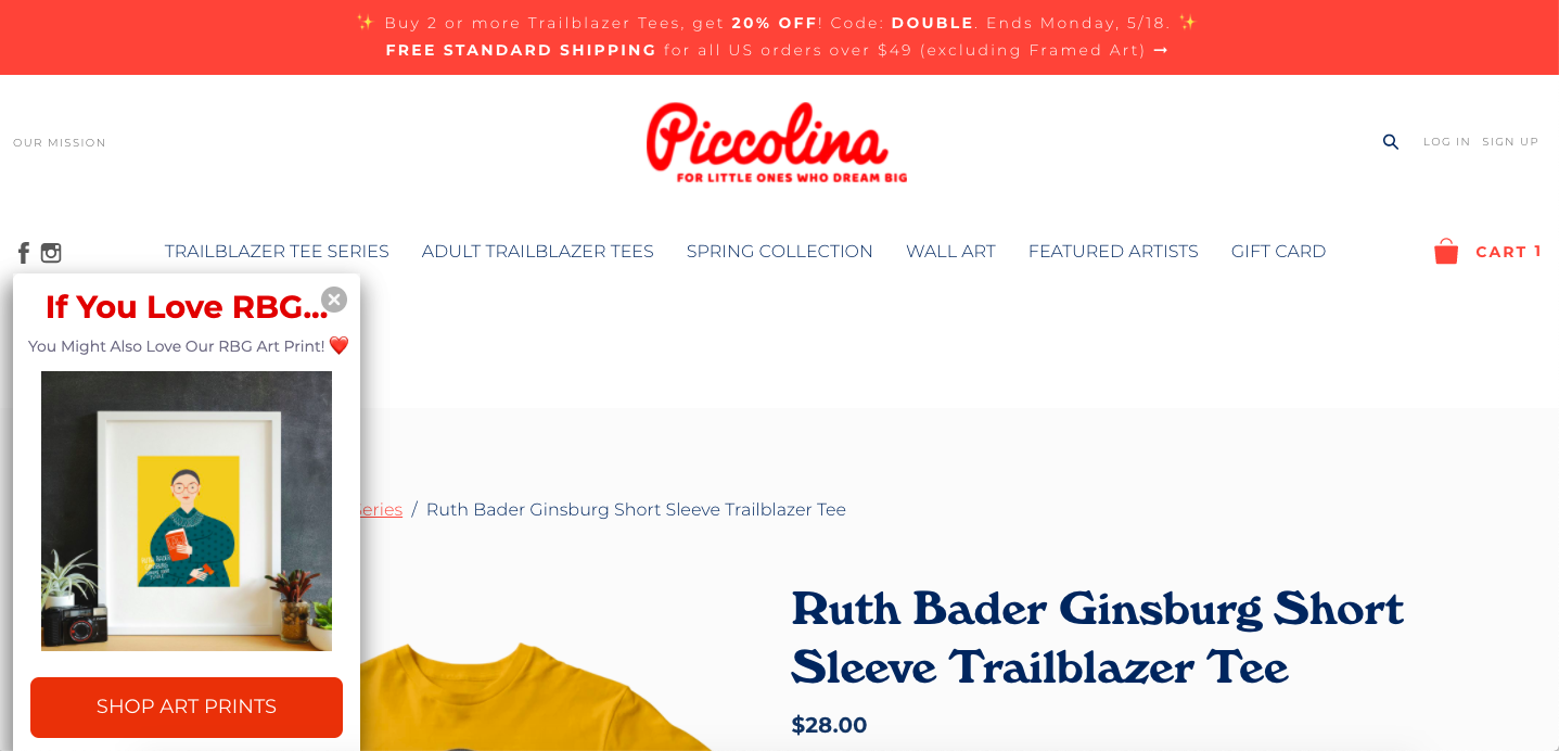 Finally, as mentioned earlier, bars are best for promoting a sale or free shipping, as they can remain visible throughout the user’s time on your website. Piccolina also leverages their bright red bar at the top of their page to promote an ongoing sale.
Trigger at the right time
What you show is just as important as when you show it. Visitors have short attention spans, especially with the thousands of websites they’re visiting.
Ultimately, timing depends on your goal. A welcome campaign should trigger within a few seconds of the user visiting your site, whereas an upsell or cross-sell campaign would work best after the user has had some time to invest in your site, or perhaps even add something to their cart. Generally, the later the pop up triggers, the fewer eyes it will reach – but the higher the conversion rate as visitors spend more time engaging (and falling in love) with your brand.
Show it to the right people
Pop-ups work when served to the right audience. Let audience targeting be your BFF and use it to show your campaigns to the most relevant visitors. For example, put rules in place so that your welcome campaign will only be shown to visitors who have not been to your site within the last month. Then, use popups to target returning visitors with a “welcome back” campaign, perhaps getting your visitor's attention with a sweet welcome back discount.
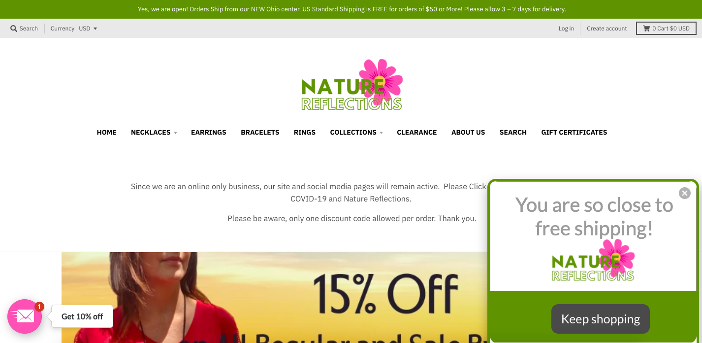
You can optimize your popups based on cart values and shopping behaviors. For instance, if you’re offering free shipping on orders of $50 and someone has $40 in their cart, you might use this as an opportunity for an upsell campaign: “Add $10 to your cart to be eligible for free shipping!” These are the visitors who are already interested in your brand.
Similarly, after clicking through a few products, you can use popups to seal the deal by incentivizing them with a pop up with a discount offer. Nature Reflections Jewelry’s upsell flyout reminds customers that they have almost hit the threshold for free shipping, in an effort to increase their order value.
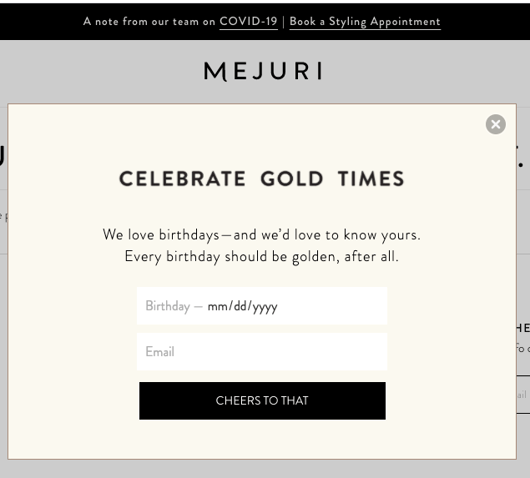
 Finally, don’t underestimate the power of continued data collection! If you already have a visitor’s email, you can start to experiment with collecting new information. For example, you can collect their birthday month and then send an email with a discount in honor of their special day (like Mejuri does). Or, your pop up might include a quick survey question about what types of products they’re interested in, so your future marketing efforts can best target that.
 A/B test as much as possible
Whether you have one pop up or ten, you’ll want to experiment to see what works best. Start by setting up two similar pop ups targeted at the same audience, with one key difference (such as a different headline or offer). Only make one change at a time, so you’ll know what made one pop up perform higher than the other.
Craft your offer carefully
The hard facts are, if the offer doesn’t pique your customers’ interest, they won’t engage. So know your goals and then word your offer accordingly. Are you trying to grow sales with a 10% offer on the spot, or expand your email list with the promise of a discount later? Clear marketing strategy is key to directing and tracking the course of campaigns.
Prominent call-to-action
I can’t stress this enough. CTAs 👏 are 👏 your 👏 friend 👏! Make sure your pop ups have a strong call-to-action that’s easy to read within your design, with high contrast and high visibility. For example, you’ll often find buttons that read, “Sign Up,” “Shop Now,” or “Get Started,” frequently with the button in a bright color.
A catchy phrase or countdown for urgency can give your campaign an extra boost, so get creative with it! But whatever you do, make sure it’s simple and easy for the customer to exit the pop up. By annoying your customers with a pop up they can’t easily leave, you could shoot yourself in the foot and hurt your reputation. This is the key difference between spam pop ups and legit, valuable ones; the ability to easily opt out. Do this by including an “X” button or a “no thank you” option, and make it large enough so they can click away – even on a mobile device.
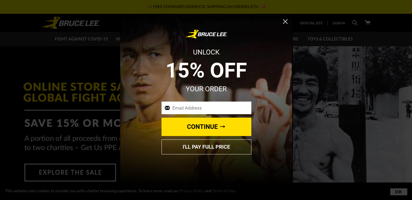
If you’re worried about customers peacing out too soon, you can get cheeky with your “no thank you” option copy. The example below from Bruce Lee gives a prominent option for customers to opt out by letting them select “I’ll Pay Full Price.” Since most people would prefer a discount, it’s added psychological incentive to sign up.
 Don’t ask for too much info
When it comes to user experience, you want to make it as easy as humanly possible for your customers to engage with you. The more your website feels like marketers asking customers to fill out on a form, the less likely they’ll be to actually do it (trust me, this applies to more than just onsite displays. Ever try getting anyone to do anything, ever?).
Achieve simplicity by asking only for the information you truly need, such as name and email, or phone number if you’re using SMS marketing. Once you have this data, you can get more specific with your ask with each new targeted campaign.
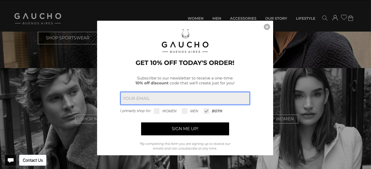
In their welcome campaign, Gaucho Buenos Aires keeps things short and sweet by only asking visitors for their email, and a checkbox response so they know which types of products they’re most interested in.
 Use a responsive design
Engaging with a pop up designed for desktop on your mobile device is like trying to fit my adult-sized torso into teeny doll clothes. It’s not fun for anyone involved. For each onsite campaign, create one design for desktop and one for mobile, so the user experience is great for both.
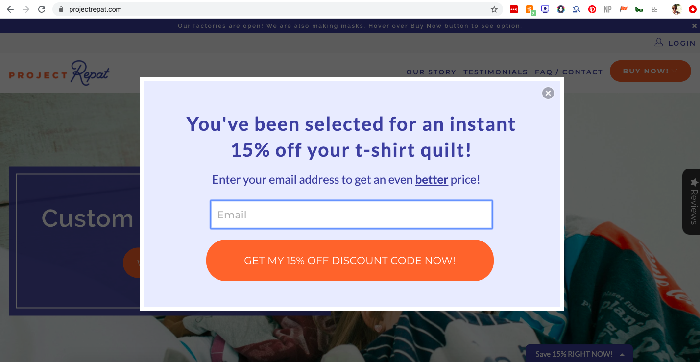
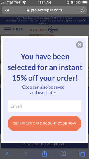
Our friends at Project Repat did this by creating both a desktop and mobile version of their current welcome campaign, each with similar copy and readable text for each format. They even clarify on the mobile version that their discount code can be saved and used for later, assuming the visitor probably won’t be completing their purchase on their phone.
Make it visually appealing
With most tools having great template options, you don’t need to be a professional designer to have beautiful pop ups. A guaranteed win is to keep the design simple; pop ups that are too busy or text-heavy may lose the viewer’s attention.
For a fail-proof pop up design, use this formula:
1. Be eye-catching
2. Clearly state benefits
3. Offer assurance
4. Strong CTA
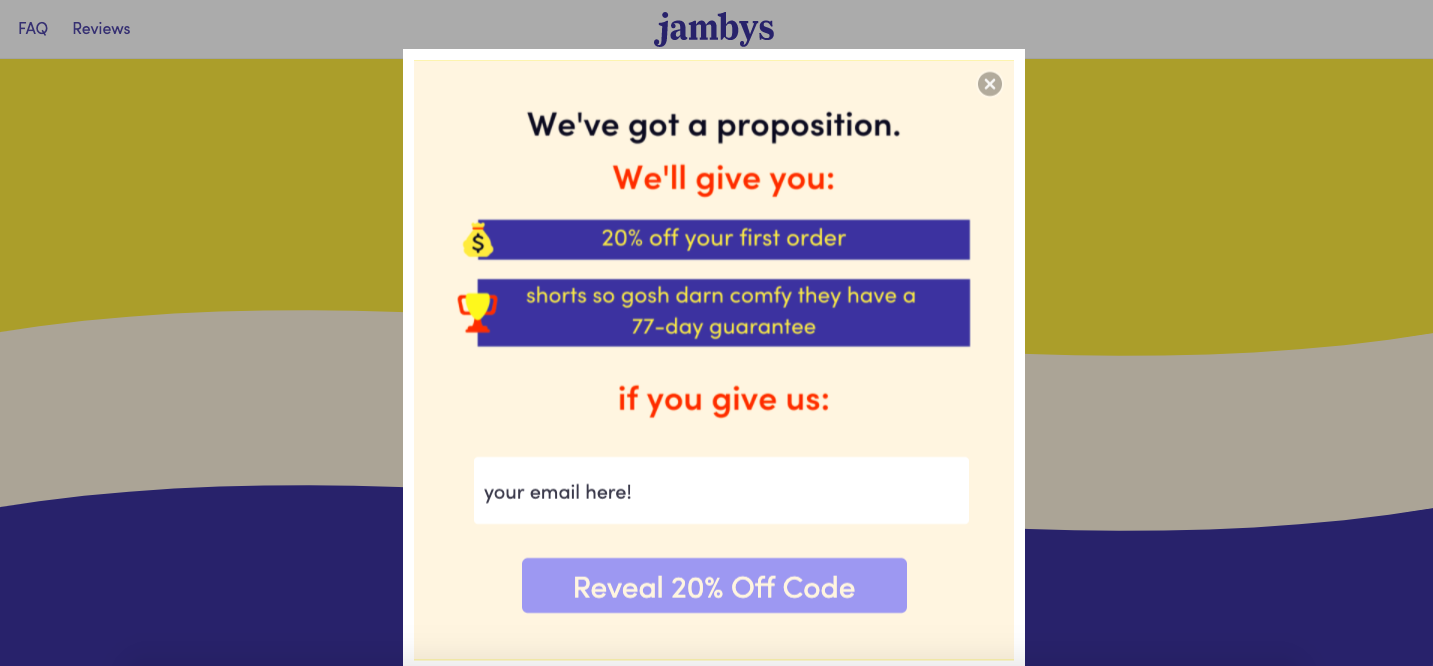
Your pop ups are an extension of your website, so use them as an opportunity to reinforce your branding. Recall your own experiences as an online shopper; cohesive brands build credibility. Jambys’ welcome campaign is designed to be cohesive with the rest of their branding, and their copy reflects their playful brand voice.
 Understand your stats
Finally, once you’ve decided how you want to design your campaign, focus on results and how they stack up to your goals. Don’t expect to see crazy high numbers. Of course, every business is different, but as a general rule of thumb, we say a 5% sign up rate is solid and a 10% redemption rate is pretty good. So if you’re seeing those stats, great job! If you’re still working towards it, A/B testing is a great way to experiment and find what works for your audience.
Takeaways
When it comes to pop ups, it can be easy to just slap together a simple welcome campaign without giving it a second thought. But because pop ups help you grow your email list (a channel you own completely) and increase order value, you want to be strategic about your digital marketing campaigns and really optimize this tool.
With our revenue reporting functionality, we’ve seen businesses reduce bounce rates and earning thousands, if not millions of dollars by playing their pop up game smart. Imagine the possibilities when you make a few minor tweaks.
Subscribe for Updates
Get our best content on ecommerce marketing in your inbox 2 times a week.

Written by Rachel Waldmann
Subscribe for Updates
Get our best content on ecommerce marketing in your inbox 2 times a week.

.jpg)
