Boost conversion rates and collect zero-party data with these new releases
7 min read time
Published on Aug 29, 2024
Written by Kristina Simonson

Last month, we announced 3 major improvements to the Privy Convert product.
And there’s been no slowing down since.
Today, we’re excited to break down the latest batch of releases. Including:
- Support for fullscreen displays
- 4 new ways to add ‘micro decisions’ to your displays
- How to advance your cross-sell strategy with the new product element
- Driving urgency with the countdown timer element
- Transforming one display type to another
- Saving time with match styles functionality
Btw if you're an Amped user and looking for an alternative, now’s your sign to give Privy a chance. We’d love to show you what’s new!
In the meantime…let’s break down what’s new 👇
Get our best content on ecommerce marketing in your inbox
#1: Support for fullscreen displays
A fullscreen display is a surefire way to get your offer in front of your visitors.
And you can now launch one in Privy.

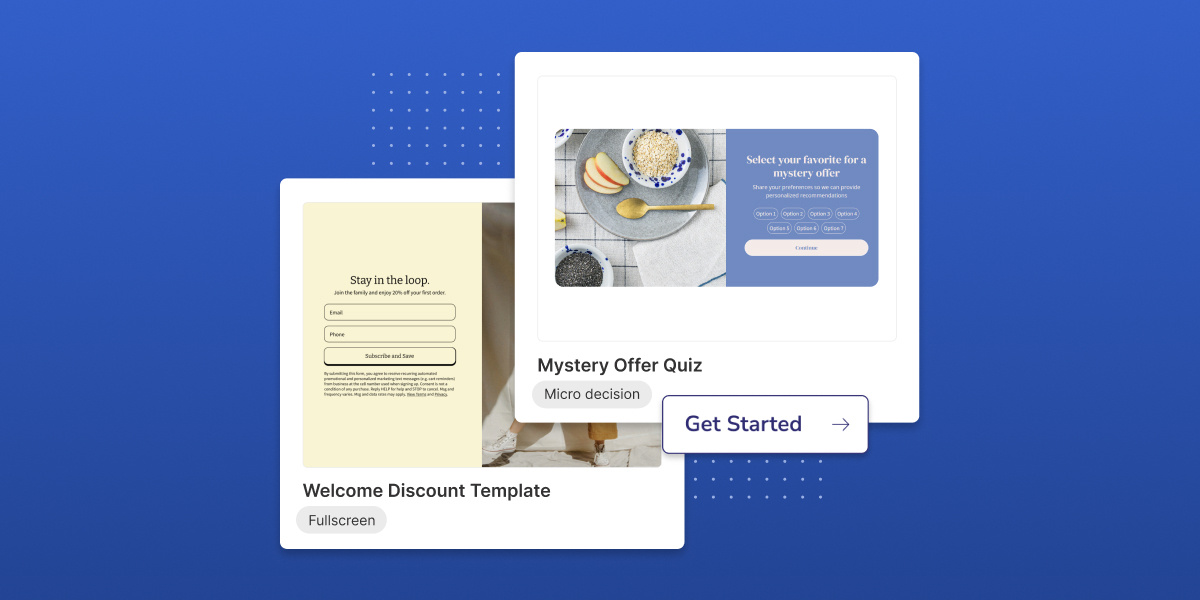
Whether you’re capturing emails, phone numbers (or both)—this focused experience is a great way to boost conversion rates. And with 8 (and counting) fullscreen templates in Privy, you can launch yours in no time.
#2: 4 new ways to add ‘micro decisions’ to your displays
With 3 brand new elements and flexible on-click actions, you can now incorporate micro decisions to shape your display experience and capture zero party data alongside your signups.
Pssttt…we’ll be using the term ‘micro decision’ in this section. When it comes to your website displays, this means hooking in your visitors by making a “small” decision that guides them in the right direction (AKA completing your display).
Here are the new releases that allow you to do this in Privy.
Mini quiz field:
This is an excellent way to get to know your visitors preferences—and make their shopping experience feel more personal. Like, asking about their skincare challenges:

This is a great first step in your display—guiding your visitor to submit their contact information on the next step(s). In this scenario, not only are you able to tailor your product recommendations based on a visitors selection, but you can learn a LOT.
How’s it work? Click to add a ‘mini quiz’ field to your display. Once it’s added, you’ll be able to customize the settings however you’d like in the right hand sidebar. Here you can add/remove options, style the element, adjust the font and control the padding around the block.
Even better? We’ll automatically create a new custom field that maps to your mini quiz. This way, you can capture their selection alongside their signup information—which can be used for future segmentation.
Checkbox and Radio Button fields:
Similar to the mini quiz field, the checkbox and radio button fields allow you to enhance your signup capture. Here’s an example of an offer with the Checkbox field:

And here's a display with the Radio Button field:

How’s it work? Like any other field, click to add to your display and then control the settings on the right hand sidebar. You’ll see you have a TON of flexibility with both of these elements—whether you want to use icons or buttons, align options vertically or horizontally, or customize the sizing to fit anything specific. And just like the mini quiz, you’ll capture visitors’ selection in a custom field, so you can use it as you nurture signups overtime.
On-click action settings:
With more flexibility to on-click actions, you can now give visitors a choice whether they engage in your display or go back to shopping. Even a small micro decision like this at the beginning of your display can make a big impact on your conversion rate.

How’s it work? Add a button to your display and then click into the settings—where you’ll see the option to ‘close display’ on click.

#3: Cross-sell (and more) with the Product element in your display
Seamlessly promote products in your displays with this brand new element:

How’s it work? With the Privy <> Shopify integration, this product element automatically pulls from your Shopify store. You can search for the product you want to promote, drag it onto your display and then style the element however you’d like.
Even better? If you make any changes to this product on your store, you can rest easy knowing your display is going to automatically update based on the product details in Shopify. Plus, if your product goes out of stock, we’ll update the display accordingly.
How would you use this? We built this to enhance cross-sell displays in Privy, so you can promote complementary products and boost average order value (AOV). But, that’s not the only way you can use this element…
You could also use it to:
- Promote a product-specific offer (a great way to clear out inventory of a specific product)
- Gauge demand for new products (so you can invest in products that are most likely to sell)
- Launch a new product (no better way to highlight what’s new than to actually show your visitors what it looks like!)
- Showcase best sellers (an easy way to get shoppers to take action if they seem stuck on your website)
And we can’t wait to see what other use cases you come up with!
#4: Drive urgency with the Countdown timer
Have a limited time sale or event coming up?
Try out the new countdown element to add urgency to your display:

How’s it work? Click to add the countdown element, select your end date and then style the element to match the rest of your display.
Psssttt speaking of countdowns….Black Friday is right around the corner (90 days away as of this Saturday 👀). And we’ve got you covered with the NEW 2024 BFCM Calendar. Sign up to get the full calendar and weekly reminders to keep you on track through the rest of the year.
#5: Transforming one display type to another
The new display type configuration tool allows you to transform your display in seconds.

This new setting gives you more flexibility to build whatever you have in mind (quickly).
How’s it work? Click the dropdown in the right hand sidebar and choose a new display type. One you select your display type, simply make any final sizing and padding adjustments to lock in your display foundation.
#6: Saving time with match styles functionality
The match styles feature allows you to quickly apply design decisions from one element to the next (saving you clicks!).

How’s it work? This setting works across buttons, forms—and even, layouts. To use it, click into your element, navigate to the "Style" tab in the right handside bar and click into the "Match Styles" dropdown. Here you'll find any saved styles based on similar elements you've already designed.
Ready to explore what's new?
All of these releases are meant to give you added flexibility and features to activate even more use cases all in one place with Privy Convert. So you can improve conversion rate, accelerate list growth, increase average order value and so much more.
And there’s no better time to optimize your website than now. Because every improvement you can find now, will compound for you come Black Friday (when traffic is at an all time high).
So, if you’re ready to explore what’s new or how Privy Convert can work for your business, sign up for a trial or book a call with a coach today.
Subscribe for Updates
Get our best content on ecommerce marketing in your inbox 2 times a week.

Written by Kristina Simonson
Kristina leads the marketing team here at Privy. She enjoys diving into the latest trends in ecommerce (and writing about them here) and is passionate about supporting independent Shopify brands. Outside of work, you can find Kristina either hanging out with her nieces or training for her next marathon.
Subscribe for Updates
Get our best content on ecommerce marketing in your inbox 2 times a week.

.jpg)
