18 Examples of Killer Emails that Drive Sales on Shopify (And The Types Of Emails You Need To Be Sending)
19 min read time
Published on Sep 1, 2020
Written by Rachel Waldmann
We know that email is a not-so-secret weapon when it comes to expanding your customer base, frequency of purchase, and average order value. We know that it’s instrumental in fortifying strong relationships with your customers and building a brand voice. We know that its ROI is too good to pass up. We feel so strongly about it that we introduced Privy Email 2.0.
So how do you make email marketing work for you? How do you take your emails from “I’m deleting this without a second thought” to “woah, I’m definitely checking this out?” We’ll show you. We’re going to dissect some of the best ecommerce marketing emails to hit our inboxes and provide you with the inspiration you need to create your own campaigns that drive sales.
Get our best content on ecommerce marketing in your inbox 2 times a week
Step 1: Make it Memorable
Good content = good engagement. Define your brand voice and make your emails stand out in an overloaded inbox by including content that is relevant and engaging for your audience.
Every email should add value for your subscribers, whether it’s a literal value in the form of a discount, helpful tips, or exciting news. Never send an email just for the sake of sending one.
As you craft your message, incorporate your brand’s voice, aesthetic, and values. Your readers should get an idea of who your brand is by reading a consistent and authentic tone – not to mention, consistency builds credibility, which small businesses need when competing with the ecommerce Goliaths.
Not sure where to start? A compelling subject line never hurt anybody. For most of your subscribers, a great subject line is the difference between actually reading an email and reflexively deleting it. Put the most important information first, use urgency when possible, and pique readers’ interest immediately.
Among my most memorable emails are those from Magic Spoon:
 What We Love About It:
- Every inch of this email oozes Magic Spoon’s fun brand, from the colors to the whimsical copy.
- The copy makes the reader feel nostalgic. Appealing to your readers’ emotion is a guaranteed win.
- The product images are dreamy and exciting. They make the reader want that cereal. Seriously, has cereal ever been this cool?
- They include social proof in the form of testimonials.
- “Memorable” doesn’t have to mean “viral.” It just has to facilitate an association in your readers’ minds. Your brand isn’t just about your colors and your logo. It’s your reputation. In this email, Magic Spoon brands themselves as a fun, healthy cereal for adults.
Step 2: Find the Right Layout
There is no one “right” way to compose a marketing email, but whatever you do, it should include (proofread) copy, quality visuals, and brand elements (including your logo).
Your layout doesn’t have to achieve designer levels of complexity. Keep it simple; we suggest using the inverted pyramid model, starting with attention-grabbing, critical information in your headline, followed by supporting details as the reader scrolls. If you’re not sure how long your email should be, check out these pointers to inform your strategy. Ultimately though, the length of your email is not nearly as important as your content and subject line.
Here are some do’s and don’ts to get you started:
DO:
- Incorporate both visuals and text into your layout.
- Create a hierarchy of information, starting with critical messages at the top. Make this visually apparent by using different font sizes and colors to differentiate information with different levels of importance.
- Let white space into your life. Blank space allows your readers’ eyes (and brains) a chance to take a break, and gives your content more room to make an impact.
- Keep your copy short, sweet, and easy to digest.
- Use a consistent and authentic brand voice, and write in a conversational tone. Make your readers feel like they’re hearing from a friend.
- Hyperlink when applicable, and make all images clickable.
- Segment your email list so you’re sending the most relevant content to the appropriate subset of your subscriber list.
- Include call-to-action (CTA) buttons.
DON’T:
- Write long, rambling paragraphs of text.
- Overwhelm your readers with emails that are too visually busy.
- Send the same generic message to everyone on your list.
- Get too into the nitty gritty details. Instead, encourage them to click a CTA and visit your website or landing page for more information.
Here’s an example that checks all the boxes from Enso Rings:
 What We Love About It:
- There’s a great mix of copy and visuals, starting with an exciting graphic at the top.
- Every piece of text is just 1-2 lines, making it easy to skim.
- The copy drives urgency with phrases like, “Limited Edition,” and “When they’re gone, they’re gone!”
- There’s white space along the borders of each section, so even though it’s colorful, it doesn’t look too busy.
- Every image is clickable, so the reader can easily visit their website to learn more or complete a purchase.
- Each distinct section has a CTA button, so the reader is never without an opportunity to click for more.
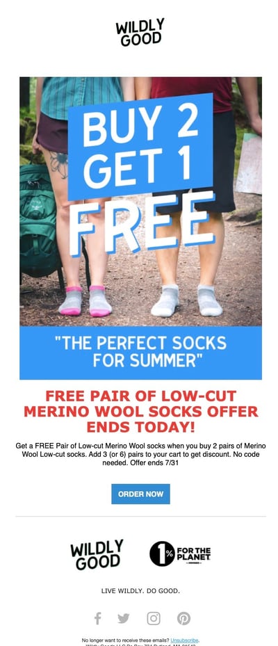
Here’s another from Wildly Good that also follows the inverted pyramid layout model:
Step 3: Include CTAs That Sell
Never forget that the goal of email marketing is to encourage your subscribers to take an action; whether it’s completing a purchase, referring a friend, or following you on social media, each email campaign should compel your readers to do something. And a strong CTA is how you’re going to get them to do it.
A CTA is most frequently displayed as a button that links out to your website or a landing page. Increase your clicks and eliminate distractions for your readers by focusing on a simple CTA with a clear and direct action you want them to take. Make it impossible to resist clicking that button.
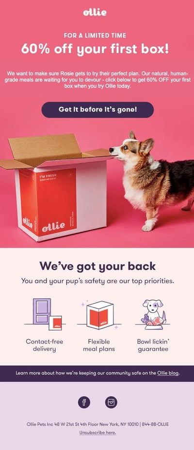
Here’s an example from Ollie:
 What We Love About It:
- Aside from this being an incredible deal, these brand colors are so fun. They make my heart happy, and they stand out from other brands in my inbox.
- There is one crystal clear CTA button that has great contrast – and drives urgency (“Get it before it’s gone!”).
- This email is personalized. The subtext at the top reads, “we want to make sure Rosie gets to try their perfect plan.” When I subscribed to this email, they asked for my dog’s name, and I told them that my dog’s name is Rosie (who, yes, I made up).
- The most critical information is at the very top of the page – and it’s a phenomenal offer, which sadly I won’t use because, again, my imaginary dog is indeed imaginary. Less essential information is ranked lower on the page.
- The image is not just branded and beautiful, but it is also a corgi. A+ for this very good dog.
Perfect Snacks also does a great job of this in their welcome email, with high-contrast CTAs spread out among lots of yummy and enticing product images:

Types of Emails You Need To Be Sending
When it comes to email marketing, there are no rules (well, except these ones). You can segment your list every which way, getting creative with your ideas and offers to engage your audience. But there are a few key emails you should incorporate as you build your foundation. Let’s take a look:
Welcome Emails
My parents taught me that it’s rude not to introduce yourself when someone new says hello. A new subscriber gave you their email address, and now it’s your turn to extend the metaphorical handshake and set the tone for who your brand is.
Your welcome can be a single email, or an entire series. When composing your welcome emails, here are a few ways to put your best foot forward:
- Automatically trigger your first email to send between 0-3 hours after you collect an email address. If you’re doing a welcome series, here’s a timeline you can use:
- After 3-5 days: Social Discovery. Build on your initial welcome email by sharing how the reader can connect with your brand online, such as your social media, blog, or other channel. If your first email included a discount, you can use this as an opportunity to drive urgency and let them know that their offer will expire soon.
- After 2 weeks: Product Discovery. If it’s been a couple weeks and they haven’t made a purchase yet, take this opportunity to remind them of your most popular products. Why do customers love you?
- After 3-4 weeks: Incentive Email. Maybe your new contact isn’t biting. That means it’s time to sweeten the deal with a discount or free shipping.
- Keep it brief. These are new contacts who may not be emotionally invested in your brand yet. Make it easy for them to become invested.
- Offer a discount or free shipping if you can, to incentivize a first purchase.
- If your brand has a story behind it, include it in your intro. Allow your new friend to get to know you and what your brand stands for. What sets you apart from similar stores?
Here’s a warm welcome we received from OUI the People:

What We Love About It:
- It starts with a strong brand voice and clear value proposition. I immediately understand why they’re different from other razors.
- Each block of text serves a purpose, and they let their (clickable!) product photos do the talking.
- Their tone is familiar. Even as a new subscriber, you understand who they are.
I also recently received a welcome from Birdie, welcoming me to their “Flock,” and outlining their important mission:

Order Follow-up
Like the name implies, order follow-up emails are triggered to send after a transaction has occurred. And similarly to welcome emails, they can be extended into a series for maximum impact.
The pinnacle order follow-up email is an order confirmation – and if you indulge in retail therapy like me, you probably receive a lot of them. But these emails don’t have to merely serve as verification that an order has been placed; order follow-ups are further chances to reinforce your brand, get your customers excited about their new purchase, and plant the seed for the next sale.
Prioritize your customer experience by including the information they may need, including:- Item(s) purchased
- Order number
- Shipping address
- Shipping timeline estimate
- Total cost
- Payment method
- Tracking information, if available
You should also:
- Continuously improve by using order follow-ups to extend a survey asking for feedback.
- Get some free advertising by encouraging customers to share photos of their purchase and tag you on social media.
- Offer customers a discount or free shipping on their next purchase, to entice them to become repeat buyers.
- Expand your potential customer base by asking satisfied customers to refer a friend.
Here’s a solid shipping confirmation from Rumpl:

What We Love About It:
- This is a shipping confirmation, following an order confirmation received a few days prior. Customers value status updates, and a shipping confirmation is a fun one to receive.
- This hits lots of customer FAQs, such as items ordered (with a link to the product page), order number, shipping address, tracking number, and number of boxes the order will be shipped in.
- Rumpl encourages repeat buying by offering a 10% off coupon – one that I’ll absolutely use next time I make a purchase from their website.
- There’s an additional offer: “Get $15 Off.” When the reader clicks that image, they are invited to join Rumpl’s rewards program, which builds customer loyalty.
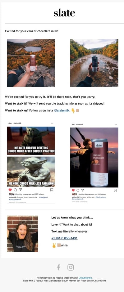
And here are a couple of winners from our friends at Slate:
What We Love About It:
- It gets the customer excited about their order. In fact, it outright asks, “Excited for your cans of chocolate milk?” (Spoiler: the answer was yes.)
- They invite customers to continue to engage with their brand by following them on Instagram – they even insinuate that they like to feature customer photos, so the customer is already thinking about sharing one.
- It sets expectations for next steps: you’ll receive tracking information once the order ships.
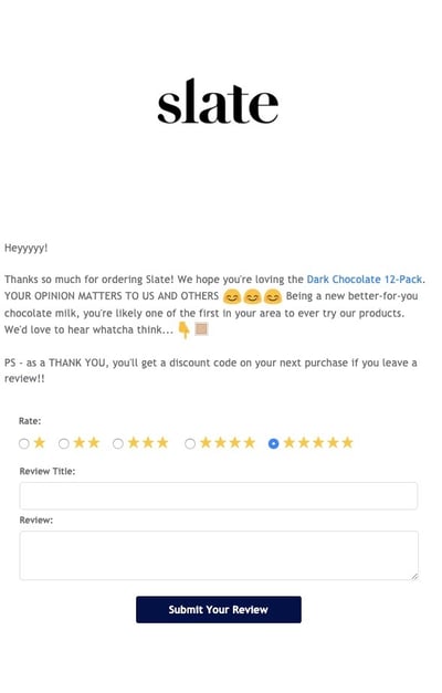
What We Love About It:
- It’s so simple. It’s not flashy. It’s just their logo and some text.
- They acquire social proof with a review, and increase the likelihood of another purchase by offering a discount in return. Win-win.
- You can use tools like Yotpo to automate this!
Personalized Recommendations (Upsells & Cross-sells)
Newsflash: everyone loves to feel like they’re special. So you can win big if you make your customers feel like the unique snowflakes that they are. Dig into your existing customer data, and use that information to segment your subscriber list based on browsing and buying habits. This way, you can create subsets of your email list, and target them with recommendations about related products and relevant offers.
And this works. A Forrester study recently found that up to 60% of Amazon’s recommendations resulted in a sale. That’s unreal.
You can make similar tactics work for you, by:
- Cross-selling. Show customers related products that complement their existing cart or interests.
- Upselling. Encourage customers to increase their average order value, with free shipping thresholds or BOGO deals.
- Reminding customers to repurchase products that need replenishing, such as cleaning supplies, food, or personal care items.
- Keeping price in mind, and using the total average order values of previous purchases to recommend similarly priced products.
Here’s how Oru Kayak used my browsing history to inform me when a product came back in stock:

What We Love About It:
- Not only did they inform me that this product was back in stock, but they included all of the relevant information I’d need before deciding to purchase. They included images, videos, and feature lists.
- They addressed risks head-on by offering financing and support. This is a big purchase, and they understand that their customers need to feel reassured.
- They use their social media presence to their advantage here, displaying tons of real-life happy customers and linking to their positive reviews.
- If someone’s not buying, this is a tempting offer. $100 is significant.
- There’s plenty of white space, which makes the product photos of these gorgeous boots really pop.
- They address objections at the bottom. These are expensive boots, and free shipping and returns will put unsure customers at ease.
And how HELM Boots targeted subscribers who haven’t yet made a purchase:

What We Love About It:
- If someone’s not buying, this is a tempting offer. $100 is significant.
- There’s plenty of white space, which makes the product photos of these gorgeous boots really pop.
- They address objections at the bottom. These are expensive boots, and free shipping and returns will put unsure customers at ease.
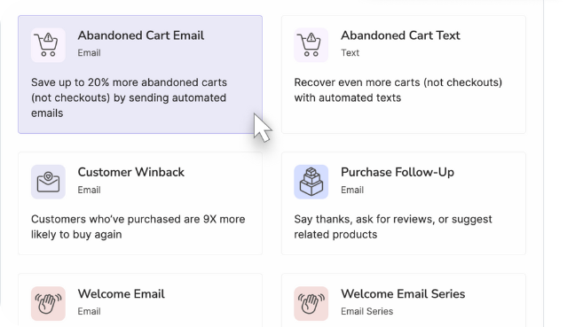
Abandoned Cart Emails
On average, nearly 70% of shopping carts are abandoned. I know. It’s bleak. That’s where cart recovery campaigns come in, bringing back your lost customers, and their money. Use these basic laws of cart abandonment to start raking in the sales:
- Show shoppers what they’re missing by including a product photo of what’s in their cart.
- Imply urgency or product scarcity to incentivize them to complete their purchase before they miss out.
- Link directly back to the cart in your email.
- Address any objections or risk and highlight any satisfaction guarantees, or free return policies.
- Offer social proof. Proudly display why people love your product. Now’s not the time to be humble. Social proof + FOMO = $$$
- Make it a series. You don’t have just one chance to make the sale happen. But that's another blog post, coming soon 😉.
Here’s the first email from an abandoned cart series by Yellow Leaf Hammocks:

What We Love About It:
- The headline immediately drives urgency: “Time is running out.”
- There is a visual of the item I left behind, in case I forgot or I need a reminder of how much I want it.
- There are a few other options to choose from, in case I’m still unsure of my original choice.
- At every point when scrolling, there’s a clear and vibrant CTA to click on.
And here’s a unique approach from Hungryroot:
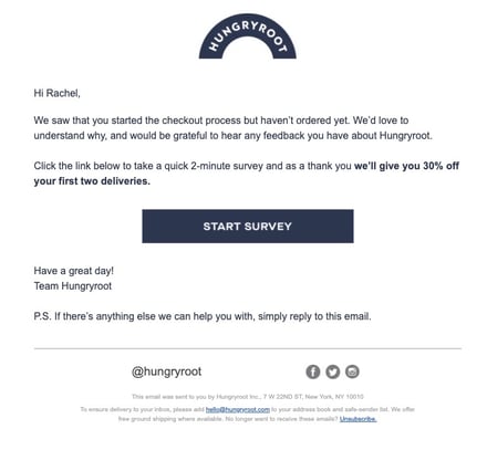
What We Love About It:
- This super simple, plain text design proves you don’t need flash to have an impact.
- They try to recover lost revenue with a 30% offer – but more importantly, they’re trying to understand why customers are abandoning their carts, so they can improve.
Win-Back or Reengagement Emails
The best kinds of customers are repeat customers. So when your customers go dormant and haven’t made a purchase in a while, it’s time to revive them. For best engagement results, try out these ideas:
- Include a short survey so you can collect intel and better understand why people aren’t buying – and then fix it.
- Offer a discount or other incentive to make a purchase. Ideally, one that’s too good to pass up.
- Put any offers directly in the subject line, to get them to, you know, actually open the email.
- Remind them of your value proposition, including any notable features or best-selling products.
- Show emotion. Not desperation, but generally being human goes a long way. Tell them you miss them!
Here’s how HelloFresh tried to convince me to come back:
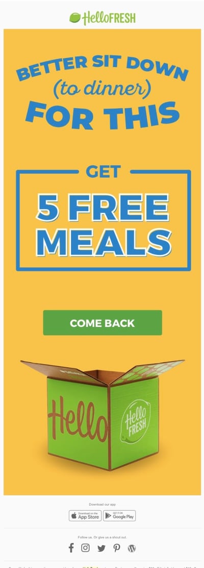
What We Love About It:
- The text is incredibly minimalistic. Because there’s not much to say. They’ve sent me newsletters and I didn’t bite. This headline and this strong offer are all they need.
- The few words they used were chosen very carefully. It feels like it’s building up to something big, and it was – 5 free meals is no joke.
- One strong CTA: “Come Back.”
Here’s another compelling offer from Le Tote:
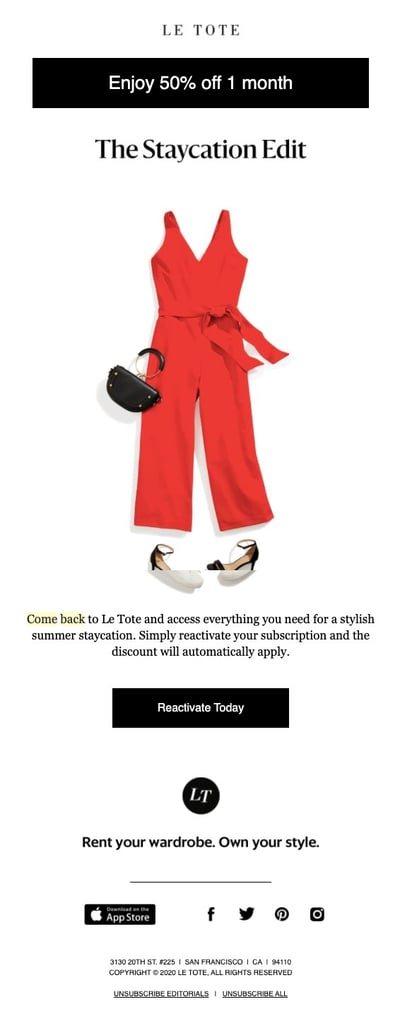
What We Love About It:
- The offer is the very first thing the reader sees: 50% off 1 month.
- The copy is used in a way so that it reminds the reader why they still might want to buy new clothes during a seemingly never-ending COVID-19 lockdown: it’s the opportunity to take a Staycation and look cute while doing it.
- The image is actually a gif, showing the versatility of their items, so you can mix and match for multiple outfits.
- It’s very clear from the CTA what they want you to do – reactivate your subscription.
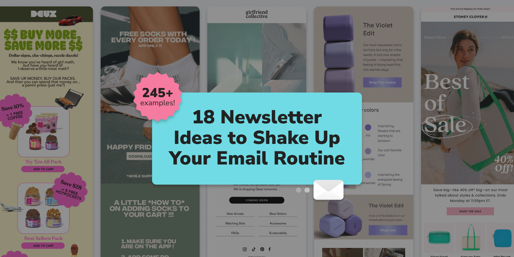
Newsletter Emails
Newsletter emails are arguably the most prolific marketing emails out there, and chances are, you receive dozens of them daily. Stand out with relevant updates – the operative word being “relevant.” Send emails too frequently, and you’ll just create more noise in your subscribers’ inboxes. Or worse, they’ll unsubscribe and then you’ve basically lost them forever.
Newsletters and segmentation go together like peanut butter and jelly. Help your newsletter take center stage for your targeted audience with these quick tips:
- Choose a layout that breaks up your email into distinct sections, starting with the most critical information in the first section. You’re already going to make an ask of your readers; do you really want to ask them to scroll too?
- Intersperse visuals with short lines or blocks of text, so the reader’s eye dances around the page and it’s all in a digestible format.
- Include clear and concise CTAs, and make all images clickable.
- Always, always, always make sure your email has a clear purpose for the reader. And make it really obvious. You have their attention for only a few seconds. What’s in it for them?
But how do you show them what's actually in it for them? It could be:
- An offer or discount you’re offering to everyone on the list.
- New product releases or features.
- Blog posts, tips, or other educational materials.
- Special events or webinars
- “Behind the scenes” content to show your human side and build a stronger relationship.
Here’s one I love from Blume:

What We Love About It:
- There’s a theme and a reason for this newsletter: new products for back to school. The subject line is “Class is back in session,” followed by the headline,” “Meet the new kids in class.”
- The design of this email is fairly simple, and there’s a good amount of blank space between blocks of text.
- Their CTAs are big, bold, and the “Open Sesame” one is super fun. This is one of the first emails I’ve received from Blume, and I feel like I get what their brand tone is.
And here’s a newsletter from Morgan & Milo, reminding the reader why they’re a unique kids’ shoe brand:

Why We Love It:
- Right out of the gate, this email reminds busy shoppers why these tiny shoes are different; they feel like walking on a cloud. They’re built with play in mind for your kiddos.
- There’s plenty of white space, so the pops of color on the shoes and in the CTAs really stand out.
Takeaway: If you think your emails could be better, borrow inspiration from brands you love.
Email has enormous ROI potential as your primary tool for driving ecommerce sales. But sometimes it’s difficult to know where to start and how to cut through the noise.
You’re not reinventing the wheel. Sometimes, the best ideas are the ones already in your inbox from your favorite brands. Pay attention to their copy, their use of images, their CTAs, and their layouts, and make them work for you.
Subscribe for Updates
Get our best content on ecommerce marketing in your inbox 2 times a week.

Written by Rachel Waldmann
Subscribe for Updates
Get our best content on ecommerce marketing in your inbox 2 times a week.

.jpg)
