9 Simple Shopify Hacks to Boost Sales In 2022
9 min read time
Published on Feb 22, 2022
Written by Lauren Hall
It’s tempting to go down the rabbit hole of complex ecommerce marketing guides, but you might end up with more headaches than sales.
If you want to simplify your path to generating more revenue, you’re in the right place. After working with more than 600,000 ecommerce brands, we know small tweaks to your Shopify store can have a big impact on your bottom line.
Whether you just launched your brand or you’ve generated millions in sales, there are always opportunities to level up your Shopify store, and many of them only require a few clicks.
This article covers 9 Shopify hacks to grow your audience and increase sales, without adding more work to your plate in the long run.
(Pro tip: if you want a shortcut to optimize your site, Privy’s free Shopify store grader tells you exactly what features you’re missing).
Now, on to the tips.
- Put a "Shop Now" button on your homepage
- Add a welcome popup to your site
- Launch a cross-sell popup or email
- Add an SMS field to your popups
- Set up abandoned cart remidners
- Make your free shipping bar dynamic
- Create an exit intent popup
- Add customer reviews for your products
- Make sure your site is mobile friendly
Get our best content on ecommerce marketing in your inbox 2 times a week
1. Put a "Shop Now" button on your homepage
A “Shop Now” or “Buy Now” button is a shortcut for making a purchase. This button sends website visitors to a collection of products or a featured item you want to boost sales for.
The buy button simplifies the purchasing process for customers so you can capture as many “impulse buys” as possible. For example, if someone finds your brand on Instagram and visits your site, you want to minimize the number of steps between “I like this” and “I’m buying this.”
Here’s an example from Bite:
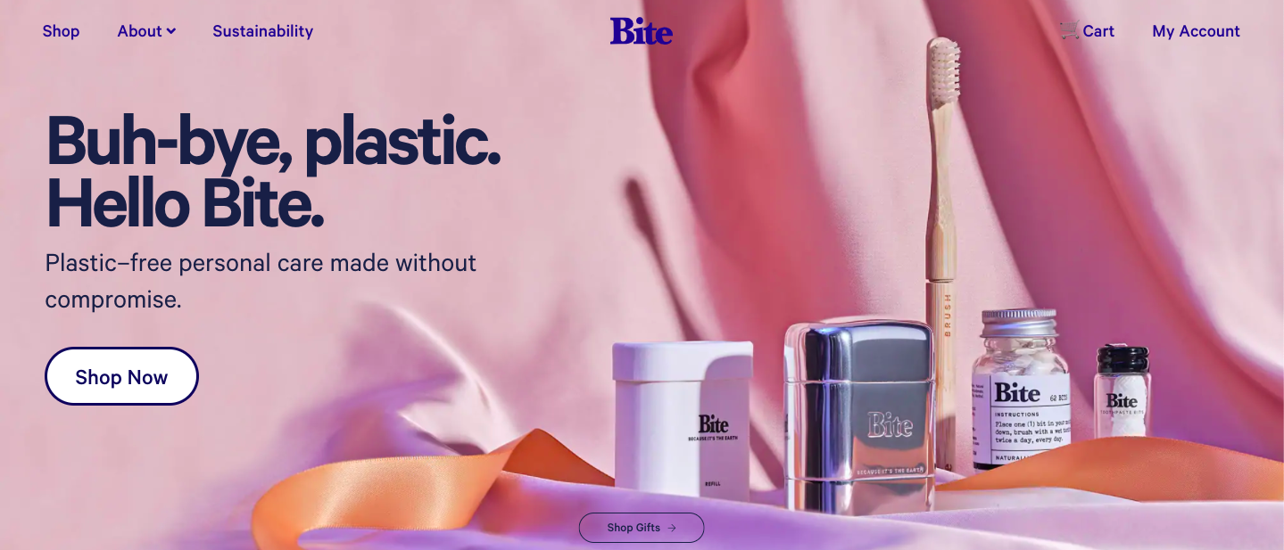 Notice their simple value proposition and clear call to action: Shop Now.
2. Add a welcome popup to your site
First-time visitors to your website might not plan to buy something right away, but a welcome popup makes it more tempting and invites them to join your audience so you can sell to them later on, long after they've left your site.
As the name implies, this offer “pops up” when someone lands on your site, which they claim in exchange for their email address, phone number, or both (more on this later).
Welcome popups can convert 5% or more of your website traffic into subscribers. That’s a big win, considering Shopify Plus merchants generate $22.82 per email captured.
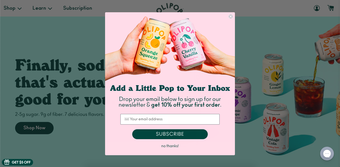
Check out this welcome popup from OLIPOP:
 3. Launch a cross-sell popup (or email)
If you sell multiple items on your Shopify store, cross-selling is a quick way to increase your average order value (AOV) without actively chasing down new customers.
Cross-selling is the process of recommending related items to shoppers after they add something to the cart. For example, when a grooming brand recommends a loofah when someone adds bath soap to their cart, that’s cross-selling.
Note: this differs from up-selling, which is when you persuade shoppers to buy a bigger or better version of the same product (like a five-pack of socks instead of an individual pair).
There are a few ways you can cross-sell on Shopify:
- Cross-sell popups that recommend items during the shopping session
- Cross-sell emails that recommend related products after a purchase is completed
- Cross-sell product pages featuring “you may also like” recommendations
Here’s a cross-sell product page from Oui the People, although this could make an excellent email too!
4. Add an SMS field to your popups
SMS messages (or text messages) from brands have open rates as high as 97%, and nearly 96% of marketers say SMS helps boost revenue. But in order to reap these benefits, you have to capture phone numbers first.
Some Shopify merchants worry that asking for phone numbers in addition to email addresses in popups will deter people from opting in, but we haven’t found that to be the case.
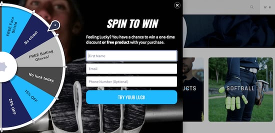
In fact, one Privy customer using a spin-to-win popup had visitors to enter their email and phone number and got an opt-in rate of 10%. That’s double the industry standard for popup conversions. Below is an example of a spin-to-win wheel with both an email and phone capture field (set as optional), growing their lists simultaneously:
If you’re still on the fence about asking for those digits, consider more than 90% of people would consider signing up to receive text messages from brands or already do.
5. Set up an abandoned cart reminder
Nearly 70% of online shopping carts are abandoned, according to research by the Baymard Institute. Translation: only about a quarter of people who add products to their cart actually follow through with a purchase. That’s a lot of money being left on the table.
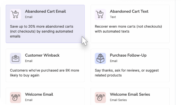
Rather than chasing down new customers to recoup these losses, abandoned cart reminders let you automatically recover a large chunk of those would-be buyers. Shopify brands using Privy’s abandoned cart emails usually recover 10-20% of their carts.
Abandoned cart popups, emails, and texts run in the background of your Shopify store 24/7. All you have to do is decide when you want to give that nudge and what your offer is. The rest is on autopilot.
For example, you can send a reminder email an hour after the customer leaves your site. If this doesn’t do the trick, send a second email with a coupon for free shipping to give the extra motivation they need.
Here’s what Solyph’s abandoned cart reminder looks like:
-3.png?width=497&name=image%20(3)-3.png) Take it a step further by sending an abandoned cart text message. Just make sure it makes sense with your abandoned cart email strategy.
Take it a step further by sending an abandoned cart text message. Just make sure it makes sense with your abandoned cart email strategy.
6. Make your free shipping bar dynamic
A free shipping bar is a banner that sits on top of your Shopify store to tell visitors how much they need to spend to qualify for – you guessed it – free shipping.
This is a quick way to incentivize purchases, but making your free shipping bar dynamic personalizes your customer’s shopping experience (and adds a sense of urgency that helps boost AOV).
A dynamic free shipping bar uses a shoppers’ cart details and updates in real time, allowing them to see how close they are to earning free shipping at checkout.
For example, if you set your threshold to $25 and a customer adds a $10 item to their cart, the free shipping bar automatically updates to “You’re $15 away from free shipping!”
7. Create an exit intent popup
An exit intent popup (or simply an exit popup) is an offer that appears when a visitor is about to leave your website.
Someone early in the customer journey probably won’t buy something the first time they visit your store. However, exit popups maximize the value of your website traffic by capturing visitor’s contact information so you can nurture the relationship in the future.
Exit intent popups usually feature a discount, an invitation to join an email list, or a combination. Regardless, this one-time setup is an easy way to turn website traffic into potential customers.
Here's an this example from the Vikings store:
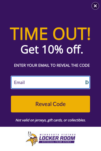 And guess what. This simple cart saver popup has helped them save thousands of orders and grow their email list.
8. Add customer reviews for your products
About 95% of customers read reviews before making a purchase, according to PowerReviews. Since customers can’t test out products in real life when shopping online, they look for social proof.
Rather than making shoppers look elsewhere for reviews (and potentially missing out on sales), add them to your product pages on Shopify. There are 300+ Shopify apps for adding product reviews to your site.
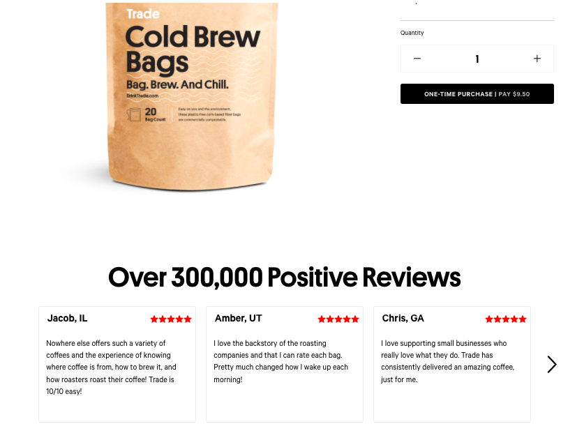
Need some inspiration? Here’s how Trade Coffee presents customer reviews on their product pages.
9. Make sure your site is mobile friendly
In 2014, mobile sales surpassed desktop sales for the first time ever, according to Shopify, and the trend has increased since then.
So if you don’t have a seamless mobile shopping experience, you could be missing out on a ton of revenue.
Here are 3 quick tips for creating the best user experience for your mobile shoppers:
- Keep the shape of your mobile popups vertical (horizontal popups can get distorted on mobile)
- Make sure the text on your site is large enough to read on mobile (use 16px as a base level)
- Enable visitors to zoom in on images
Below, we break down Magic Spoon's mobile popup display:.png?width=996&name=image%20(5).png)
Let Privy grade your Shopify store
We just gave you plenty to chew on, but if you want custom recommendations for optimizing your Shopify store for sales and conversions, check out Privy’s free store grader.
Here’s how it works:
1. Enter your website's URL
2. We automatically grade your website based on things like conversion optimization, social proof, site speed, and more
3. We provide you with recommended next steps to improve your site
Join 1,400+ Shopify store owners who have tested their websites!
Subscribe for Updates
Get our best content on ecommerce marketing in your inbox 2 times a week.

Written by Lauren Hall
Lauren is a Brand Marketing Associate at Privy. She's the brains behind all things content. When she's offline, she's obsessing over her Bernedoodle pup, Monster, and plotting ways to being a full-time Vermonter ASAP.
Subscribe for Updates
Get our best content on ecommerce marketing in your inbox 2 times a week.

.jpg)


-3.png?width=706&name=image%20(1)-3.png)
-2.png?width=2845&name=image%20(2)-2.png)
.png?width=632&name=image%20(4).png)
